The software offers users digital due diligence forms, including the Declaration of Origin of Funds, Final Beneficiary, and Politically Exposed Persons forms.
Context
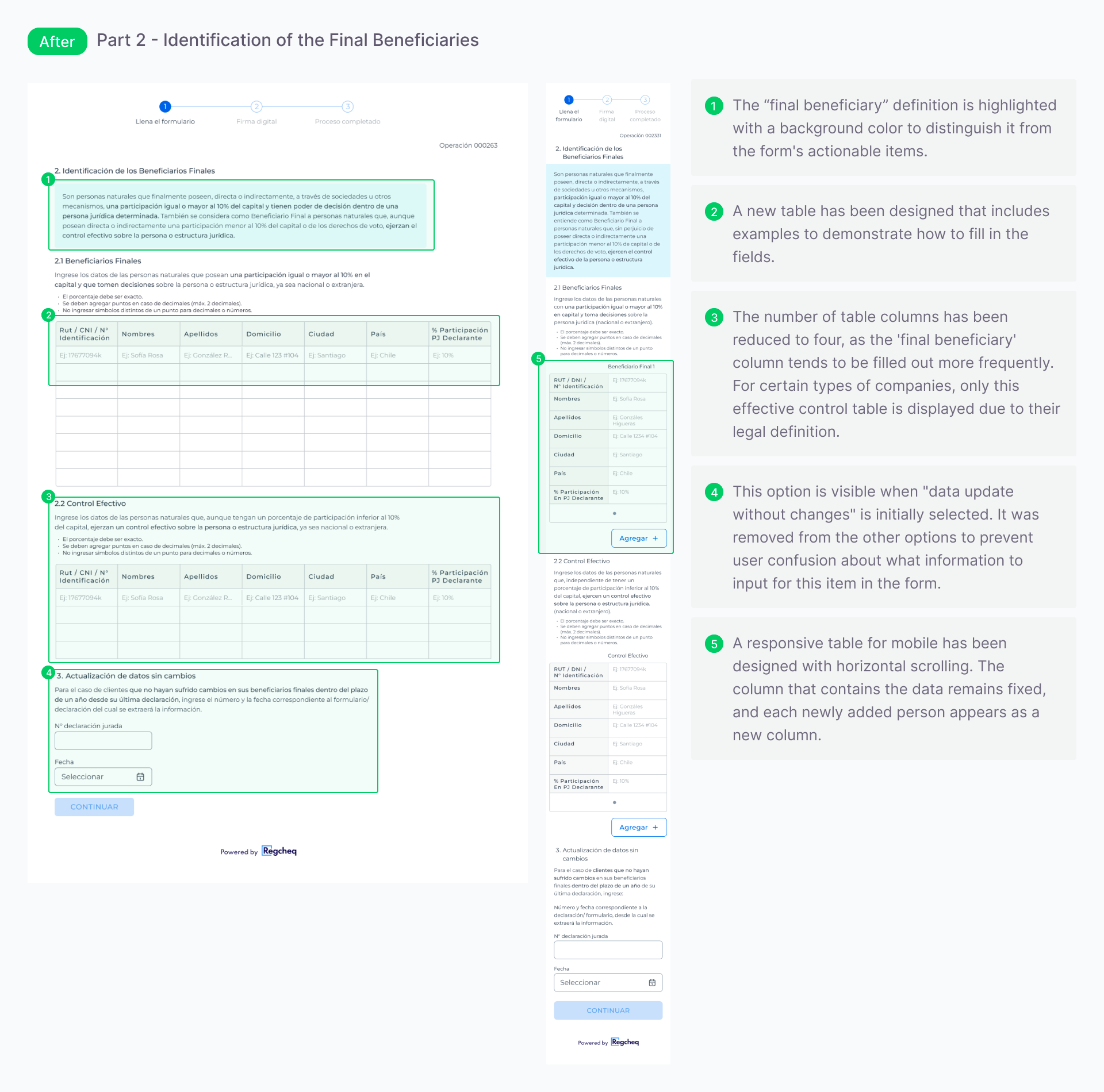
In this project, I focused on the Final Beneficiary form, which is used to identify the main beneficiary who ultimately controls the company, beyond the managers and staff.
Before I joined the project, the Product Owner and the bank had multiple discussions that led the development team to modify the form. The client believed these changes would enhance user perception and understanding. For this project, I worked closely with the Product Owner, the bank’s compliance team, and the developers.
💡 Improving the layout, breaking information into manageable steps, and making legal language clearer are key to user understanding. These changes can significantly improve the experience for those filling out the form and may increase the number of users who complete it.
Outcomes
The form's readability has been enhanced, making the completion process easier for users.
The redesign of the Final Beneficiary form initiated a project to update the other forms on the platform.
The number of signed forms increased from 5% to 23% between the first and second pilot following the redesign.
Form analysis
All Regcheq clients utilize the form, but a prototype was developed specifically with the bank to test whether sending it digitally could improve completion rates. Despite this digital approach, many forms still went unsigned.
When I first reviewed the form, I found it to be both impressive and a work in progress. This form must be submitted annually. The initial prototype was successful; however, after the bank's review, they requested changes to enhance it before resubmission. Given that this was an important client for the start-up, the team made the requested adjustments without hesitation.
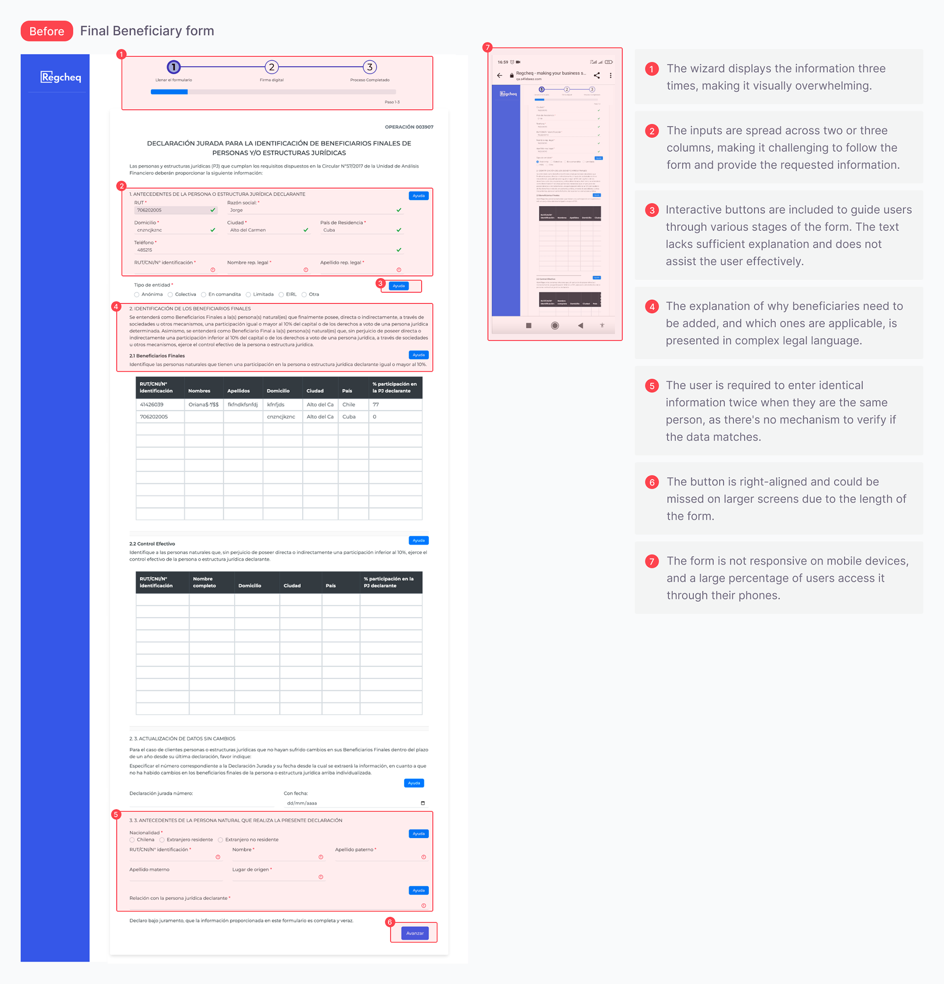
I noticed that the Product Owner and the bank representative frequently discussed and modified the form, which resulted in a cycle of unclear objectives and unmeasured impacts. These ongoing changes also affected other company clients, as the form was designed as a single template.
One modification involved adding help texts that reiterated the information in the headers. Including help buttons could assist users in understanding what was required. However, the Final Beneficiary form remained particularly complex, making it difficult for individuals without legal knowledge to complete it accurately.
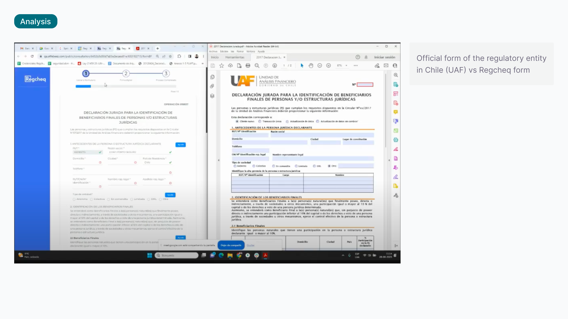
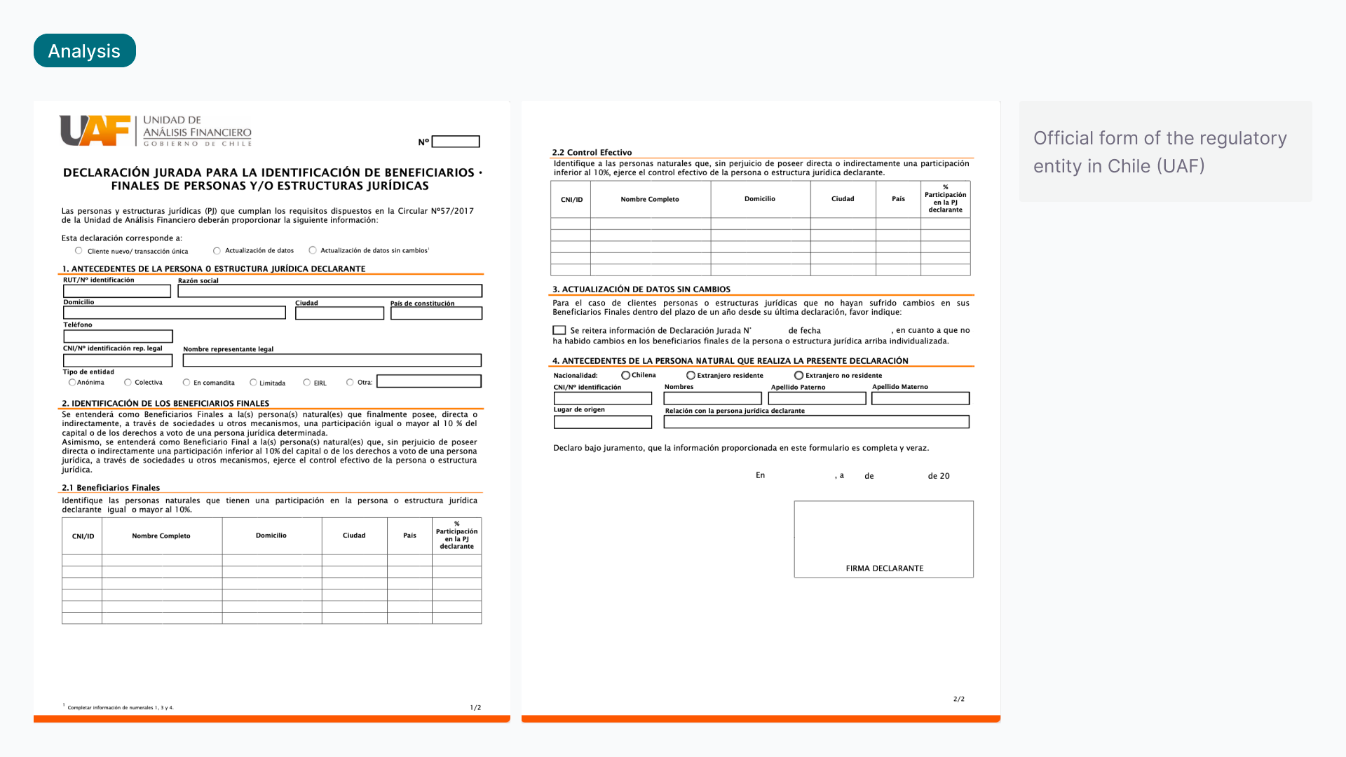
To understand the reasoning behind the form's design, I interviewed the customer success team, the developers involved, and clients to gain insights into user issues and concerns. The design was based on the original handwritten form. However, the components and technology used to create it were outdated and did not prioritize usability.
As I am not a lawyer, I found it challenging to understand all parts of the form, which has different variations and options depending on the type of company. To clarify which parts I could modify, I consulted the company's compliance lawyer. Another challenge was that the Chilean supervisory agency (UAF) does not provide documentation on the types of use or the correct way to complete the form. Many responses I received were along the lines of, "We've always done it this way." After collaborating with developers to add some features, we had to make further changes when users encountered issues during actual use.
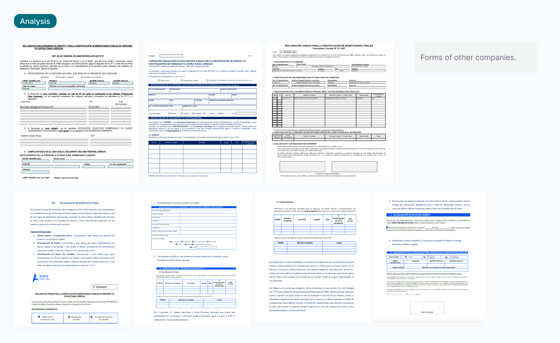
I also examined the form submission processes of other organizations to gain insight into the structure of the original form. By reviewing both the official form and those used by other companies, I identified potential areas for improvement.
Additionally, my research involved analyzing data from user session videos, heatmaps, and click rates using Datadog. This analysis helped me demonstrate to the team that users were not utilizing the help buttons that provided information.
Design process
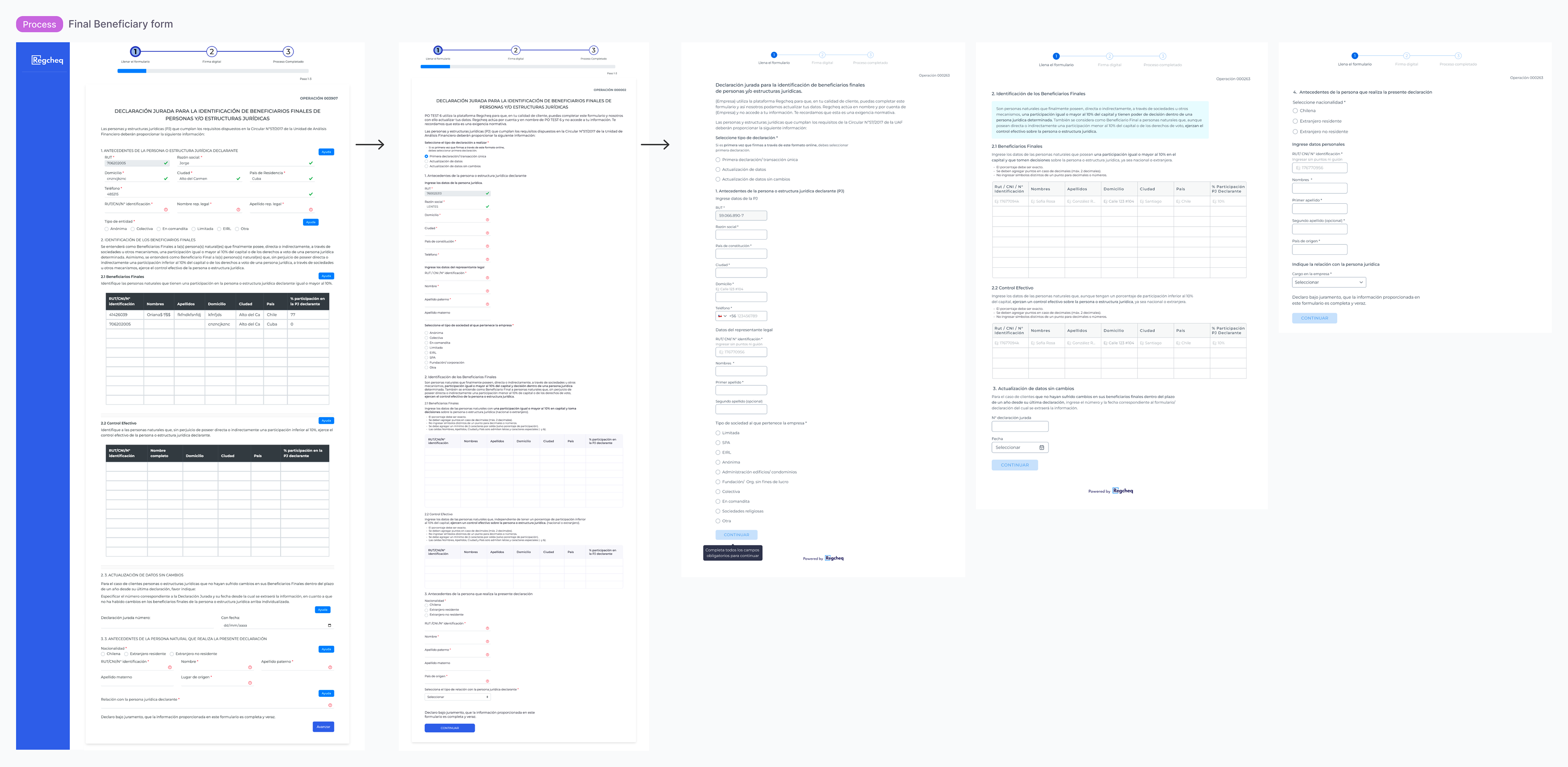
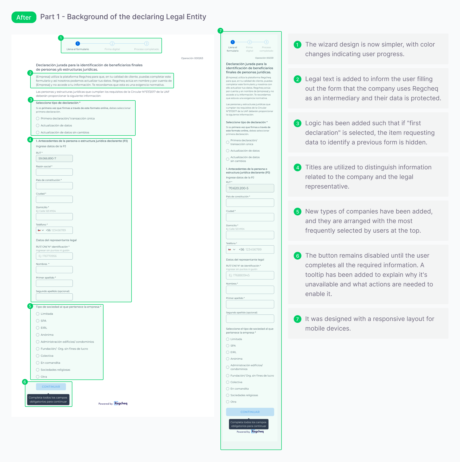
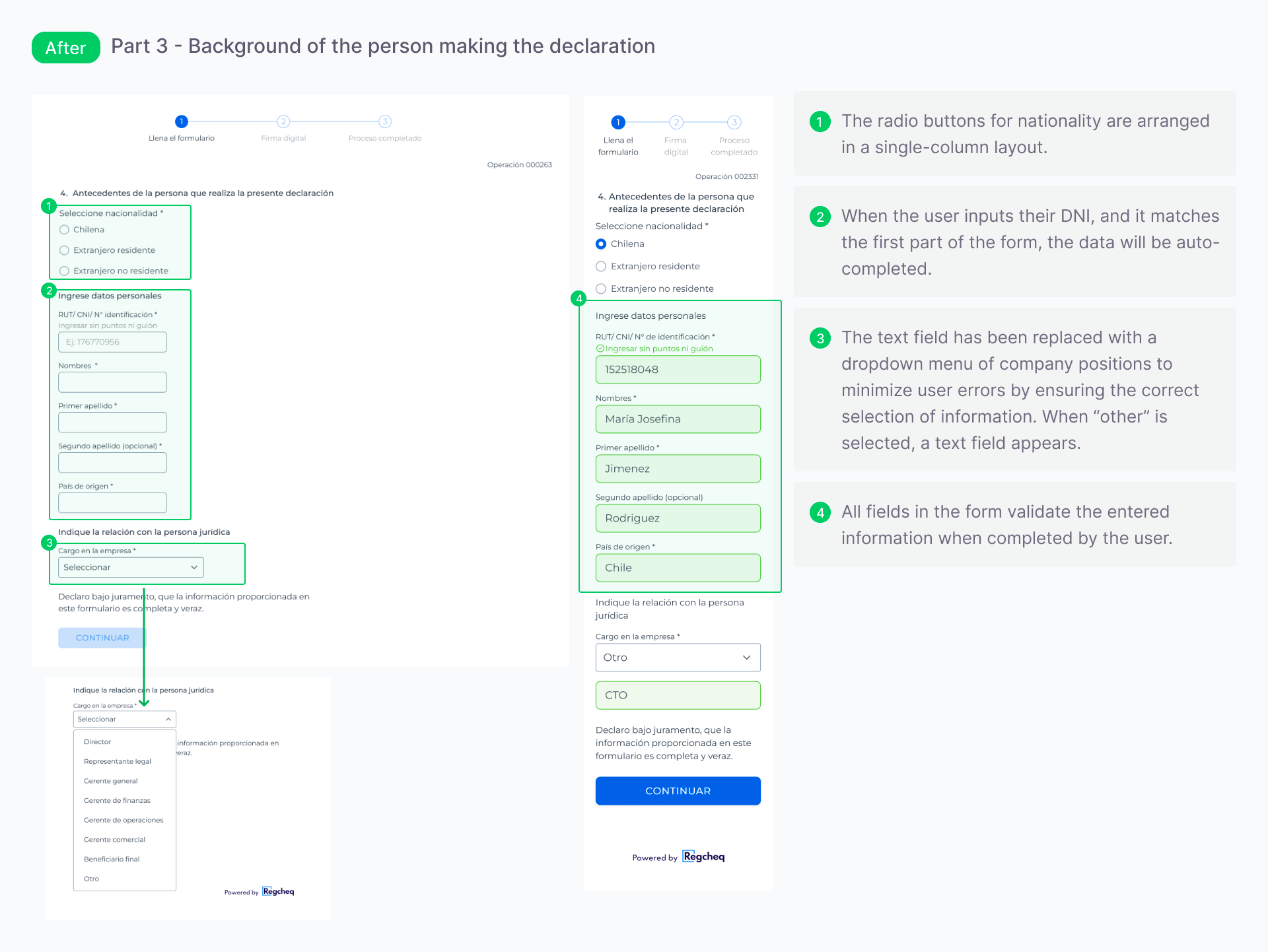
Because the team had limited capacity, with numerous projects and a small number of developers, the work was completed in stages. In the first stage, texts were reviewed, and inputs that were previously spread across multiple columns were consolidated into a single column. This step helped gather feedback for the final design.
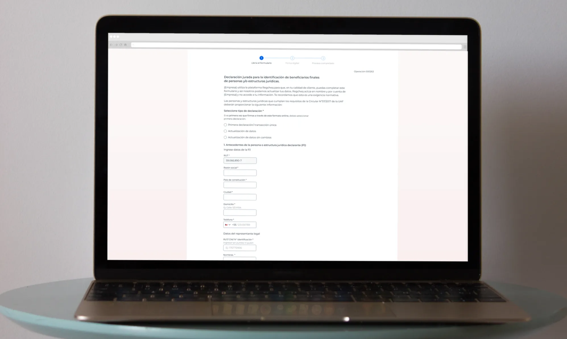
The final design changed the layout from a single page to a progressive format, improving clarity and prioritizing mobile users.
We collaborated with compliance experts to simplify the explanations, making them easier to understand and less legalistic.
Final Design
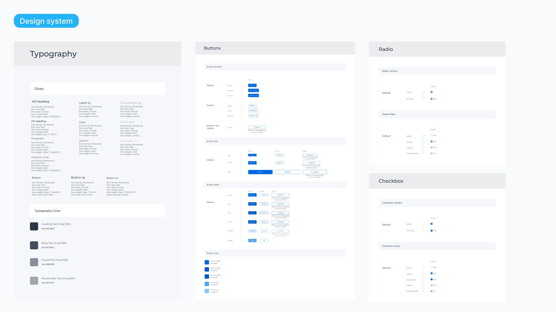
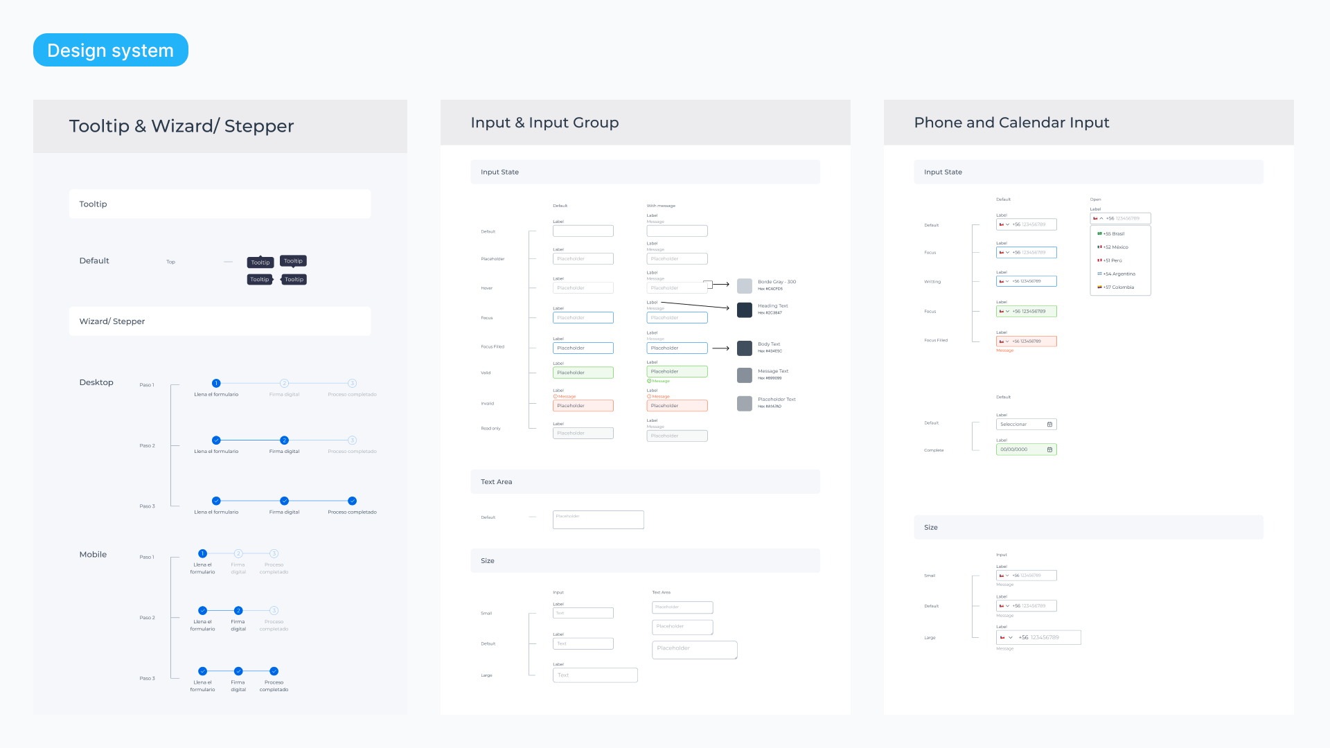
Design System
The company bought a design system, and I updated the foundation, typography, and brand colors to maintain visual consistency. With this project, we started working with developers in Storybook to document the design elements. The plan was to start with the forms and then expand this approach to the rest of the software.