Regcheq is a SaaS platform that offers advanced transaction monitoring, enabling clients to track transfers and deposits, analyze customer activity, and minimize false-positive alerts.
Context
When I joined Regcheq, I noticed that several features, particularly the transaction monitoring module, had usability issues and inconsistencies. The transaction feature, which is a key component of the platform, was widely used but had only received minor updates from the development team. As the first and only designer on the IT team, I was tasked with improving the software's usability and addressing these ongoing issues.
I focused on the New Transaction feature from the start, understanding its critical importance within the platform. My work began with minor improvements, ultimately leading to a complete redesign.
💡 The organization of information in the transaction flow led to unintentional
user errors, disrupting the process of entering new transactions.
user errors, disrupting the process of entering new transactions.
Outcomes
The readability and structure of the transaction process have been improved, making it easier for users to follow and complete.
By using simpler language and minimizing industry jargon, users can navigate the flow with greater ease and confidence.
Visual enhancements and a clearer hierarchy enable users to navigate the interface more intuitively, reducing friction throughout the process.
The redesign led to fewer user errors and a significant decrease in customer support requests, indicating improved usability and user satisfaction.
First improvements
I consulted with team members involved in designing and implementing the feature. The Customer Success team provided feedback based on user complaints, developers explained the front-end's structure, and the sales team detailed how they communicated the feature's functionality to customers.
I also used the feature myself to better understand the process and identify inconsistencies through personal testing. During my evaluation, I identified several initial issues, many of which were straightforward to resolve. These included problems with visual hierarchy, overuse of brand colors, unclear feature names, and interaction design.
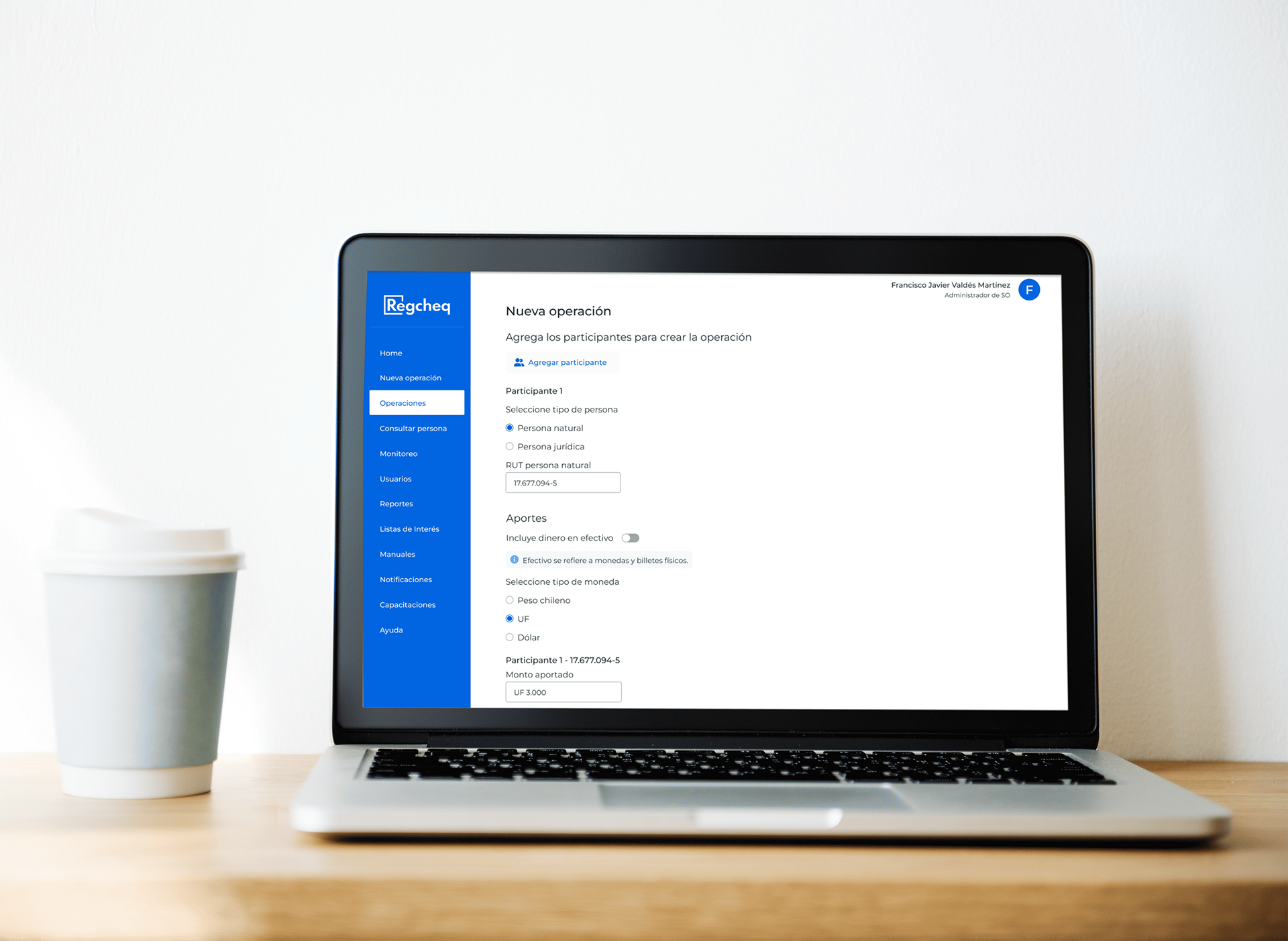
One major issue was the cumbersome process of adding participants, whether individuals or legal entities. Users had to add a new entry and delete the previous one to correct participant information. I proposed a more intuitive solution that allows users to delete a participant directly.
Initial state.
One participant, the user, can't delete it.
Two participants, appear an icon to delete the first o second.
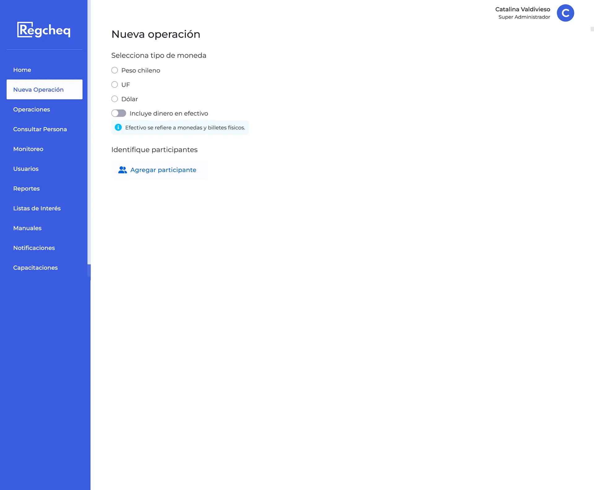
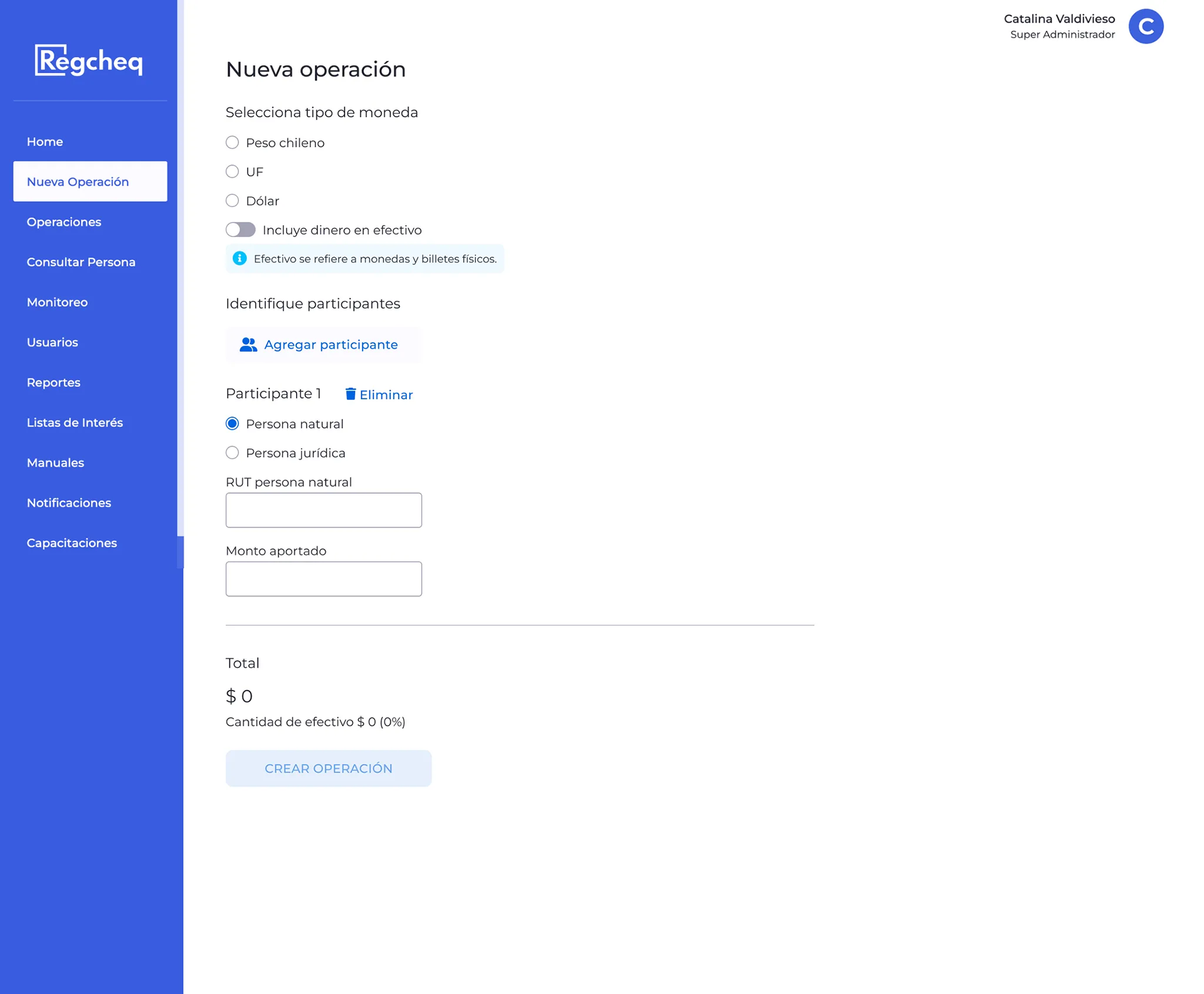
Improvements
I created a basic UI library that includes typography, color palettes, and primary and secondary buttons. I removed unnecessary blue elements, such as in switches and total displays, and aligned text and buttons to the left for better consistency. I also renamed the feature from "Iniciar flujo" (Start Flow) to "Nueva operación" (New Operation) and added an icon for easily removing participants.
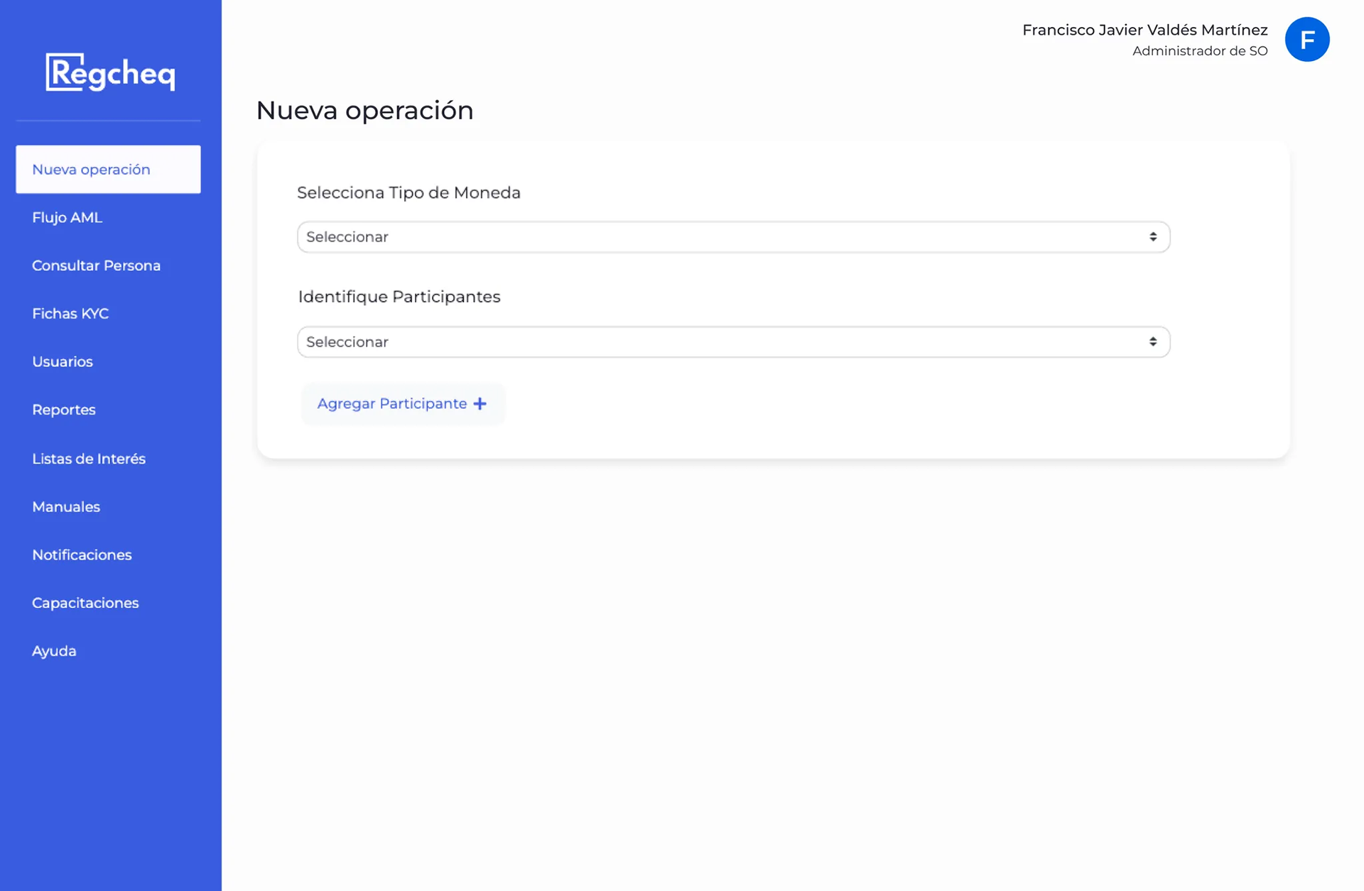
Initial state.
Two participants, user can delete the first o second.
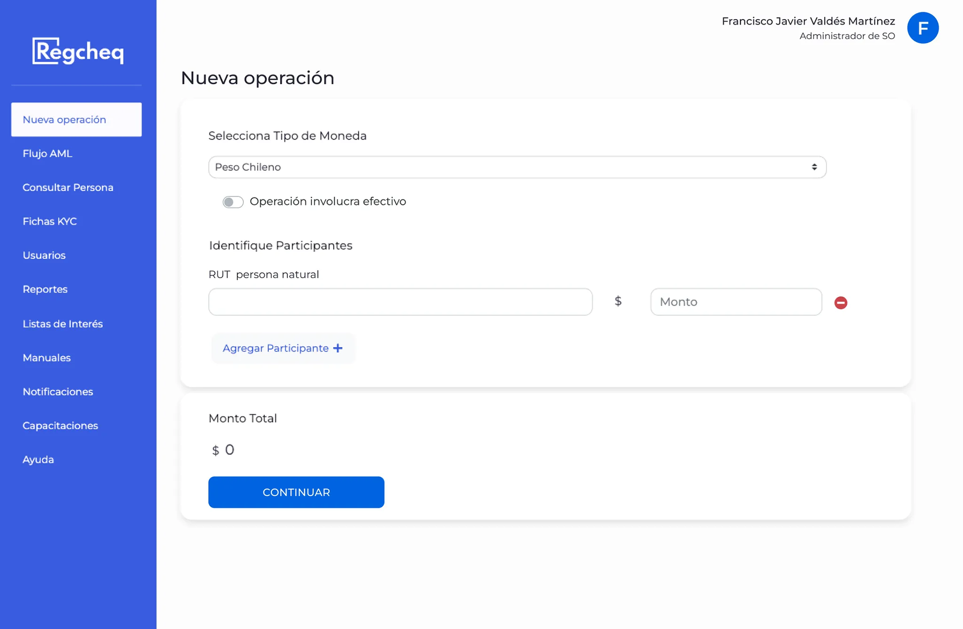
One participant, the user can delete it.
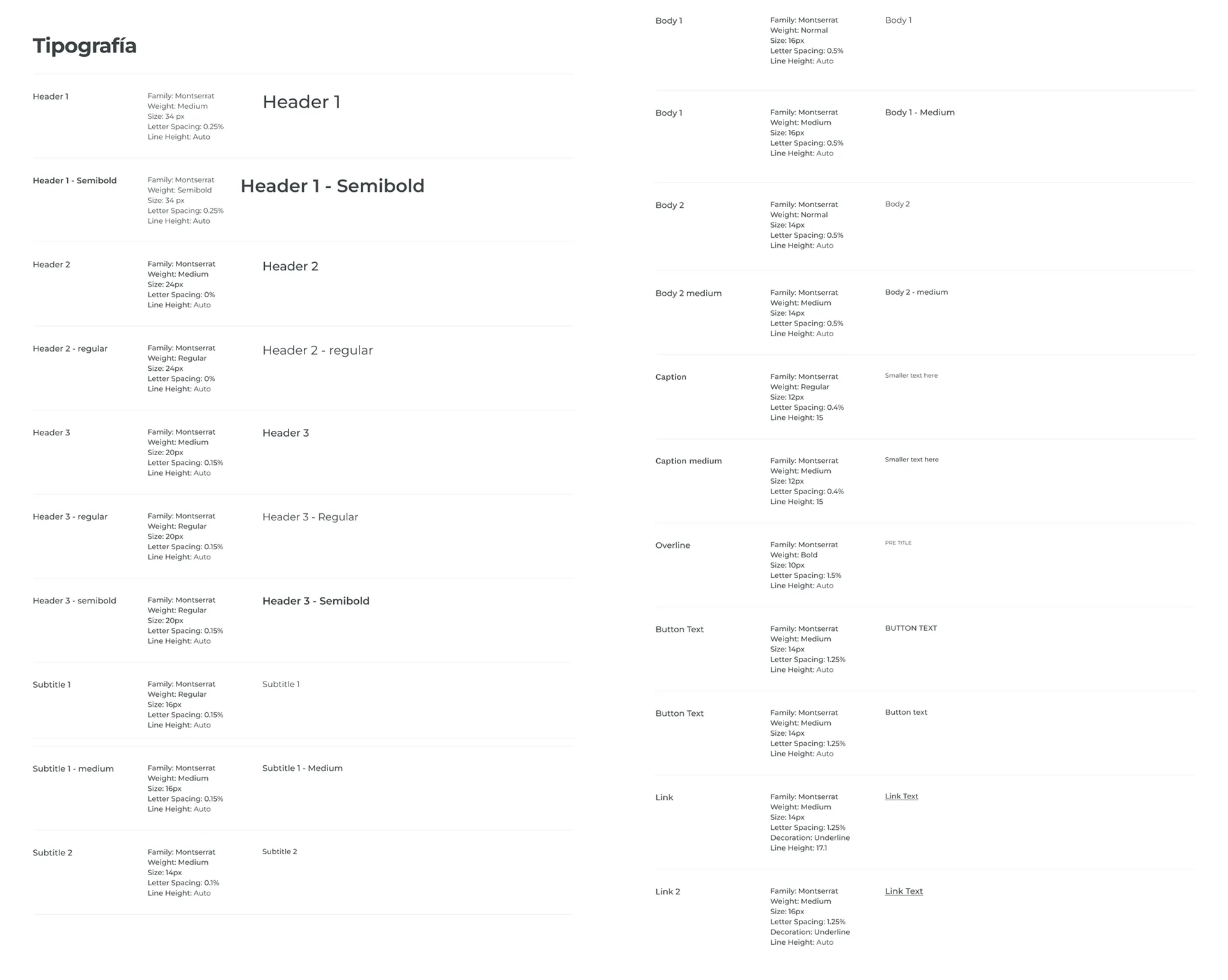
Tipography
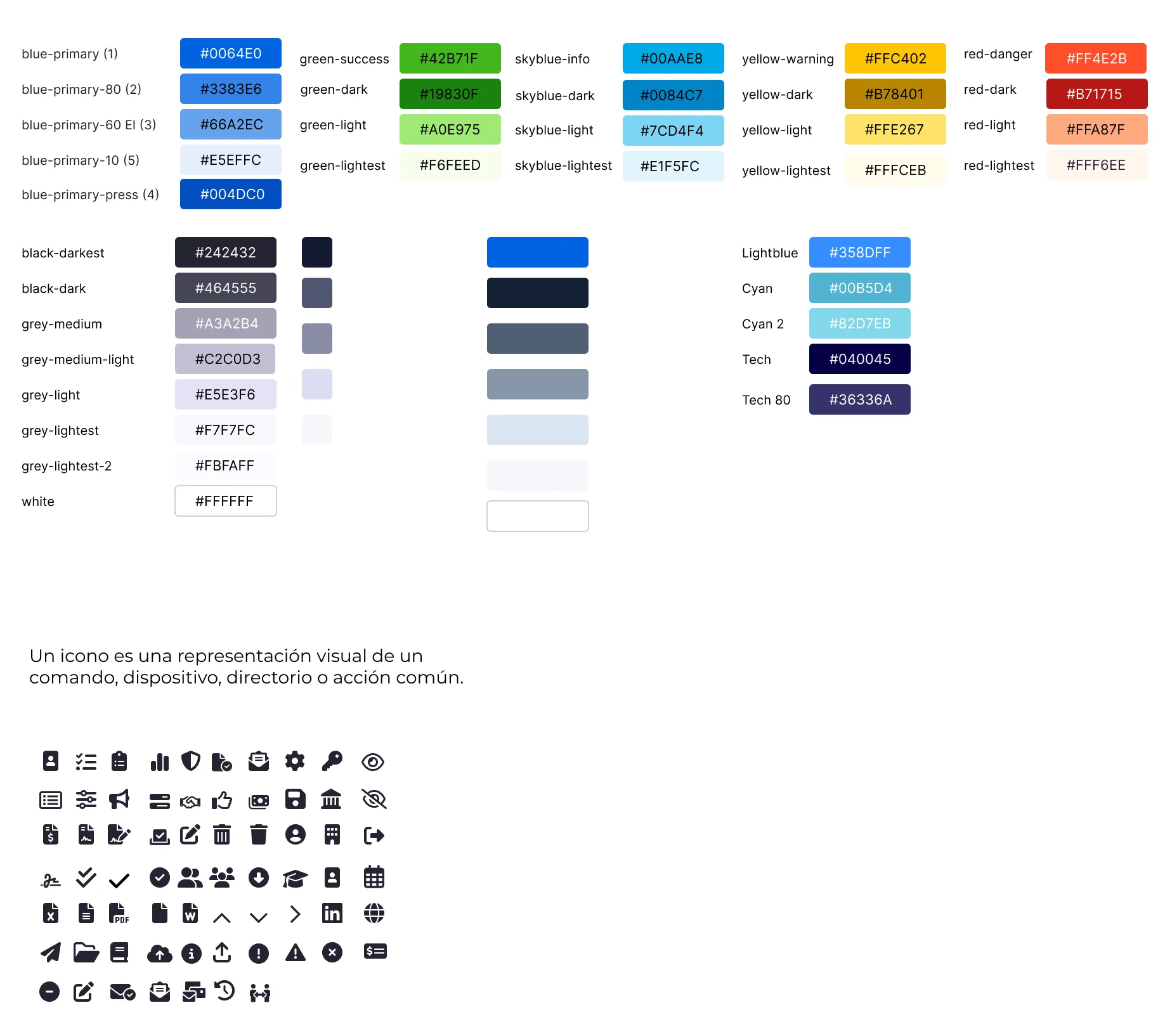
Colors and Icons
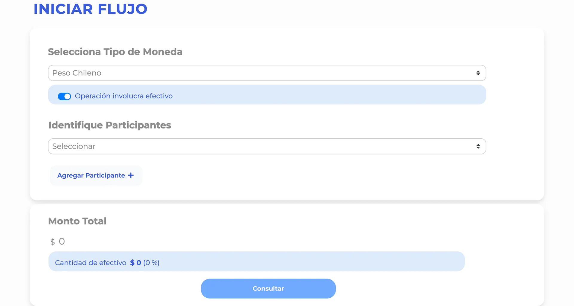
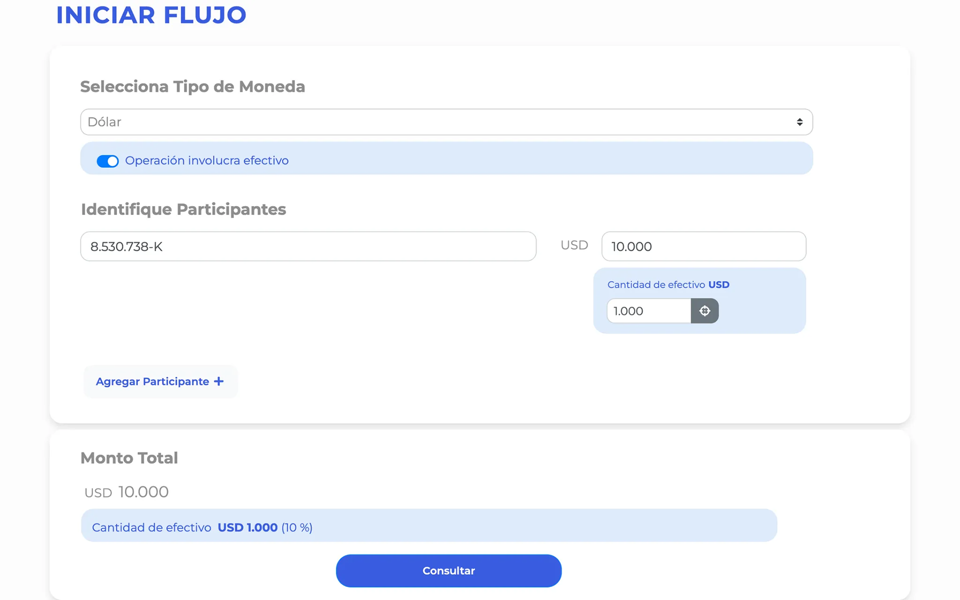
Redesign proposal (Not implemented)
The business and sales departments played a crucial role in developing new features designed to close deals and support the startup's growth.
I proposed a redesign of the functionality, although I didn’t fully grasp all the components involved. The updated design retained similarities to the original but included visual enhancements and clearer text for better user guidance.
One key change was replacing the dropdown menu for participant selection with radio buttons, allowing users to easily see and switch between participants, thereby eliminating the need for a separate delete action.
A challenge was that user options varied based on the type of participant and whether cash was involved. If cash was selected, an input field appeared for the amount.
Legal participants had more options than individuals due to the possibility of related participants, and the software notified users of prior transactions involving specific participants.
Ultimately, the redesign was set aside due to higher business priorities.
It is important to note that this redesign was informed by my experience with the software and my growing familiarity with the company. The iteration and feedback phase included only the CTO, PO, and the CX team, meaning the proposal did not receive direct validation from users.
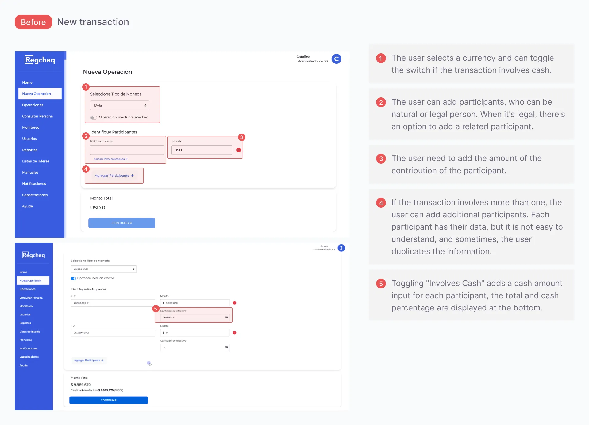
Initial state.
Natural participant.
Natural participant and legal participant. Cash switch on.
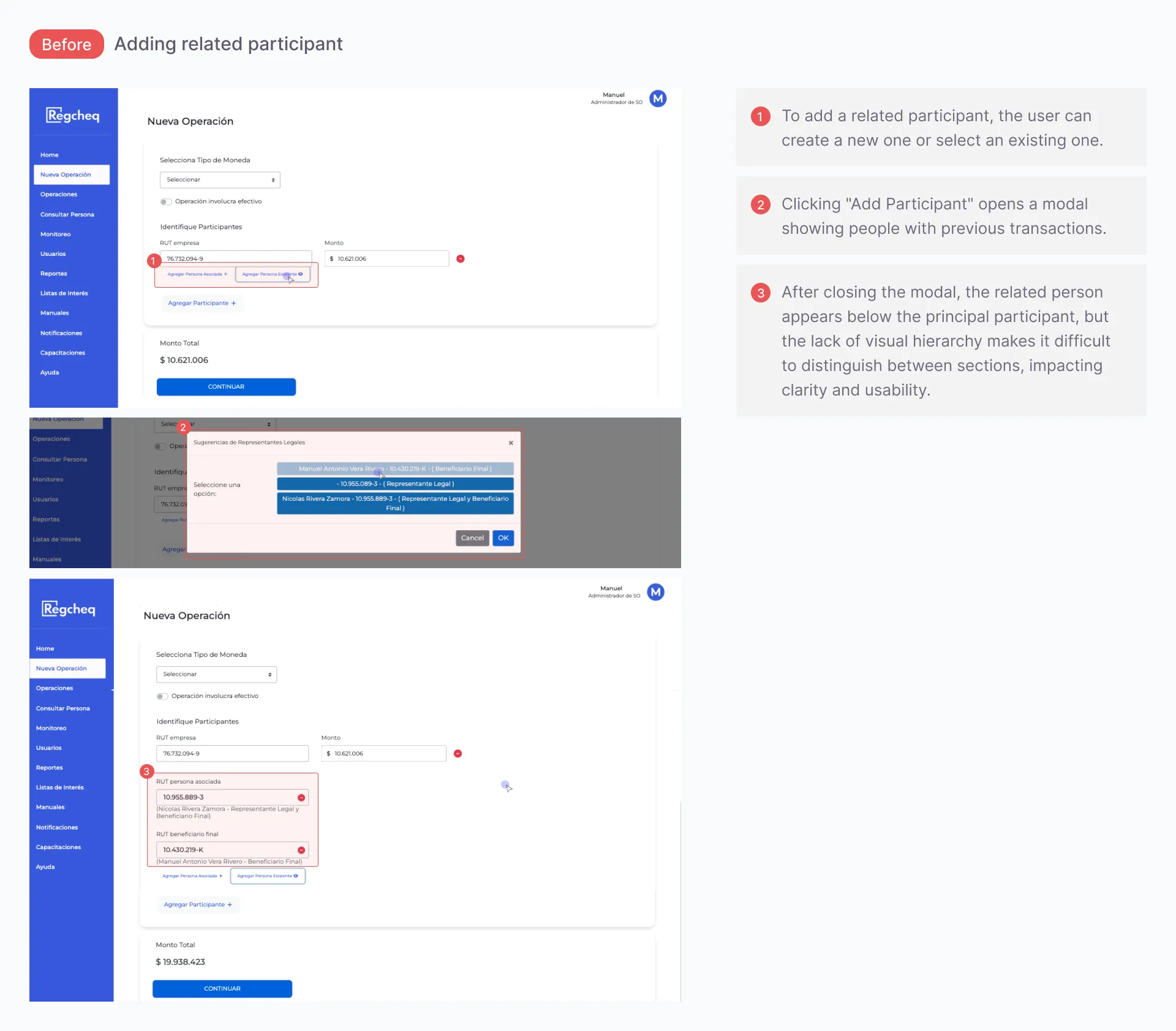
Add a related participant modal.
Feature with all the information.
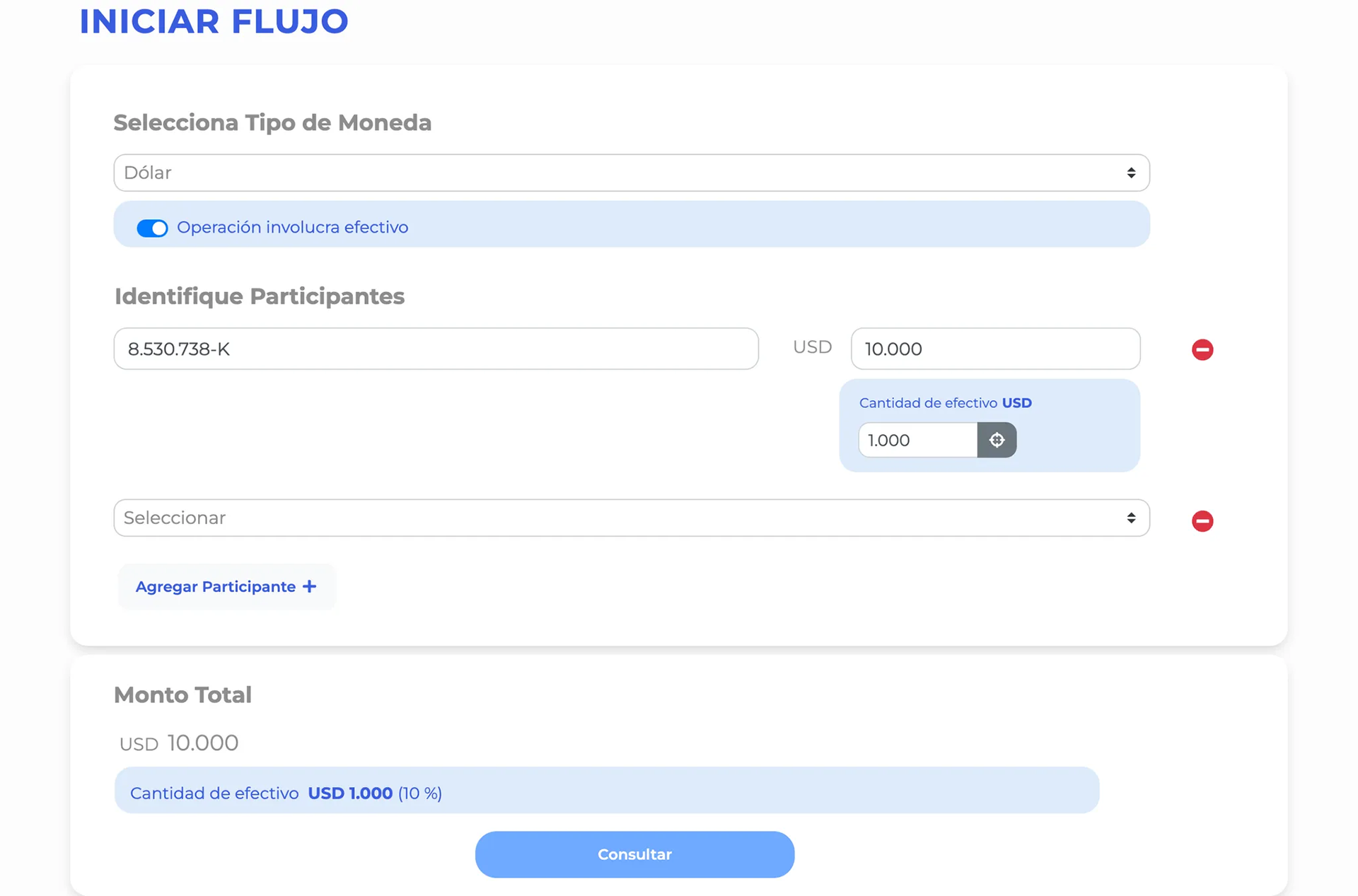
Final Redesign
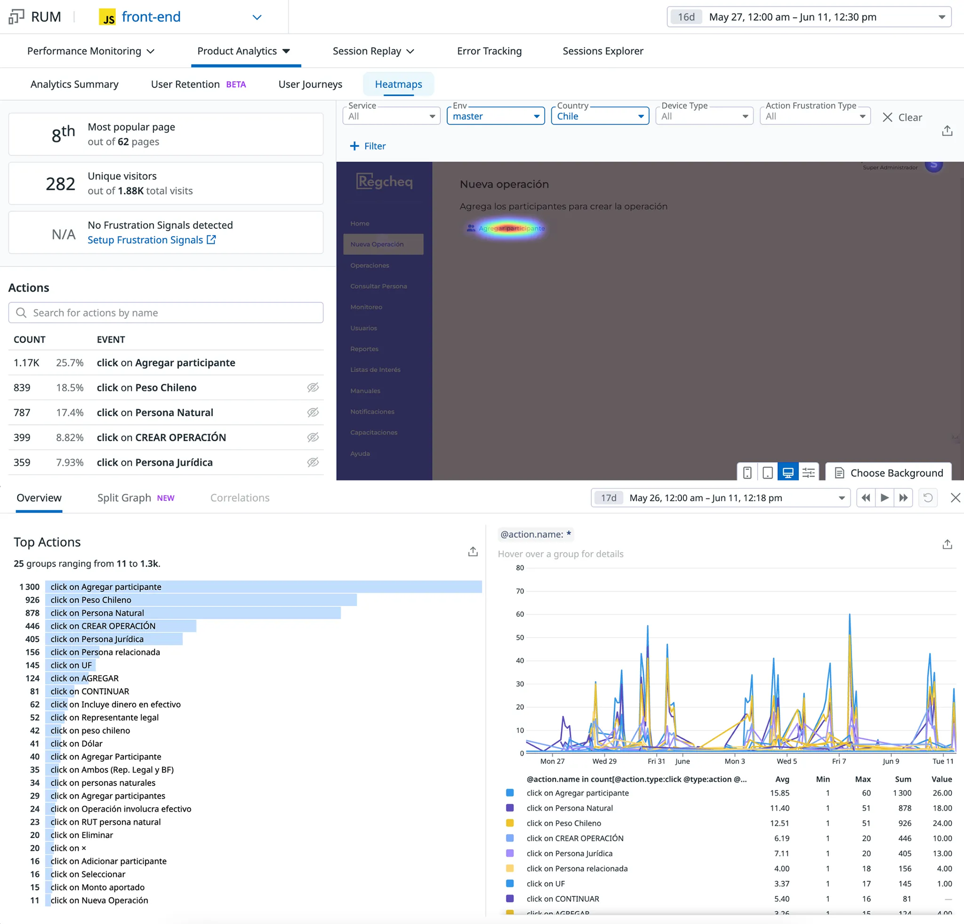
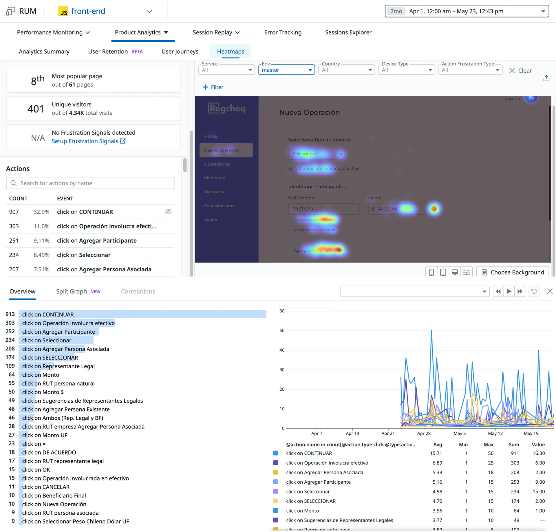
In April 2024, I revisited the transaction feature, as it had become more vital for the company. Although I managed to conduct user interviews for one or two other projects, I was unable to do so for the current one. I used Datadog’s Real User Monitoring (RUM) and session replay tools, which had been integrated into the software months earlier, to research and analyze user interactions.
Discovery
While analyzing behavioral data and interaction recordings in Datadog, I identified significant usability issues. The analytics revealed that the most common user actions were not aligned with the critical steps in the workflow. Session replays revealed that users struggled to comprehend the steps and design elements, frequently requiring assistance from the Customer Success team to navigate the feature effectively.
To address these issues, I did the following steps:
1. Analyze data from user session videos, heatmaps, and click-through rates.
2. Conduct interviews with the Customer Success team to gather insights on user challenges related to the new transaction feature.
3. Interview the development team and other stakeholders to understand how the feature was designed and defined.
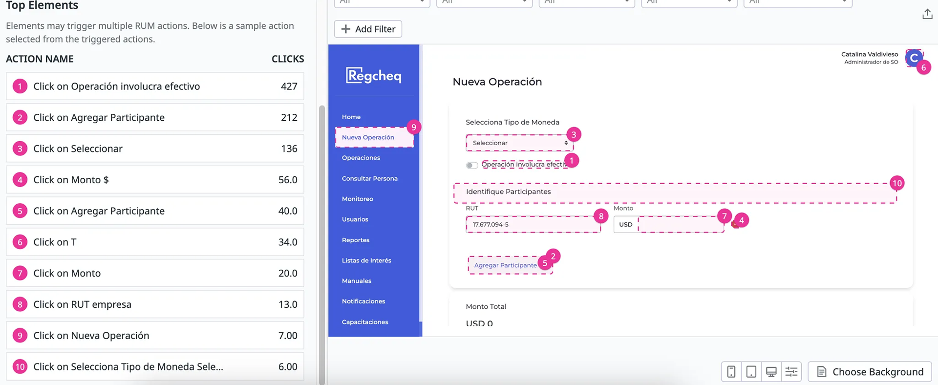
Top user actions.
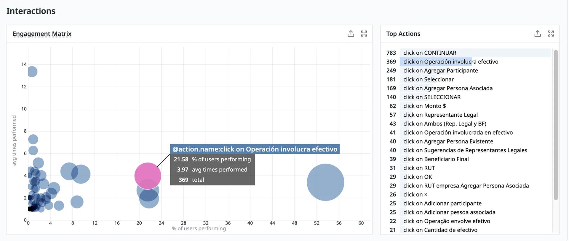
The interaction matrix of the top action.
The “Involves Cash” switch was the most frequently clicked action, even though cash transactions were the least common, as most transactions were done digitally. This revealed a usability issue: the switch's placement just below the amount input field caused users to accidentally activate it, leading to frequent errors. Another major usability problem occurred when users interacted with the input fields while adding a participant.
The layout of these fields was unclear, making it easy for users to make mistakes. The concepts were confusing, and the order of the input fields did not clearly indicate the correct sequence of actions. Additionally, once a transaction was created, users couldn’t edit its details. If they made a mistake, they had to start over and create a new transaction from scratch, which created unnecessary friction in the process.
Design
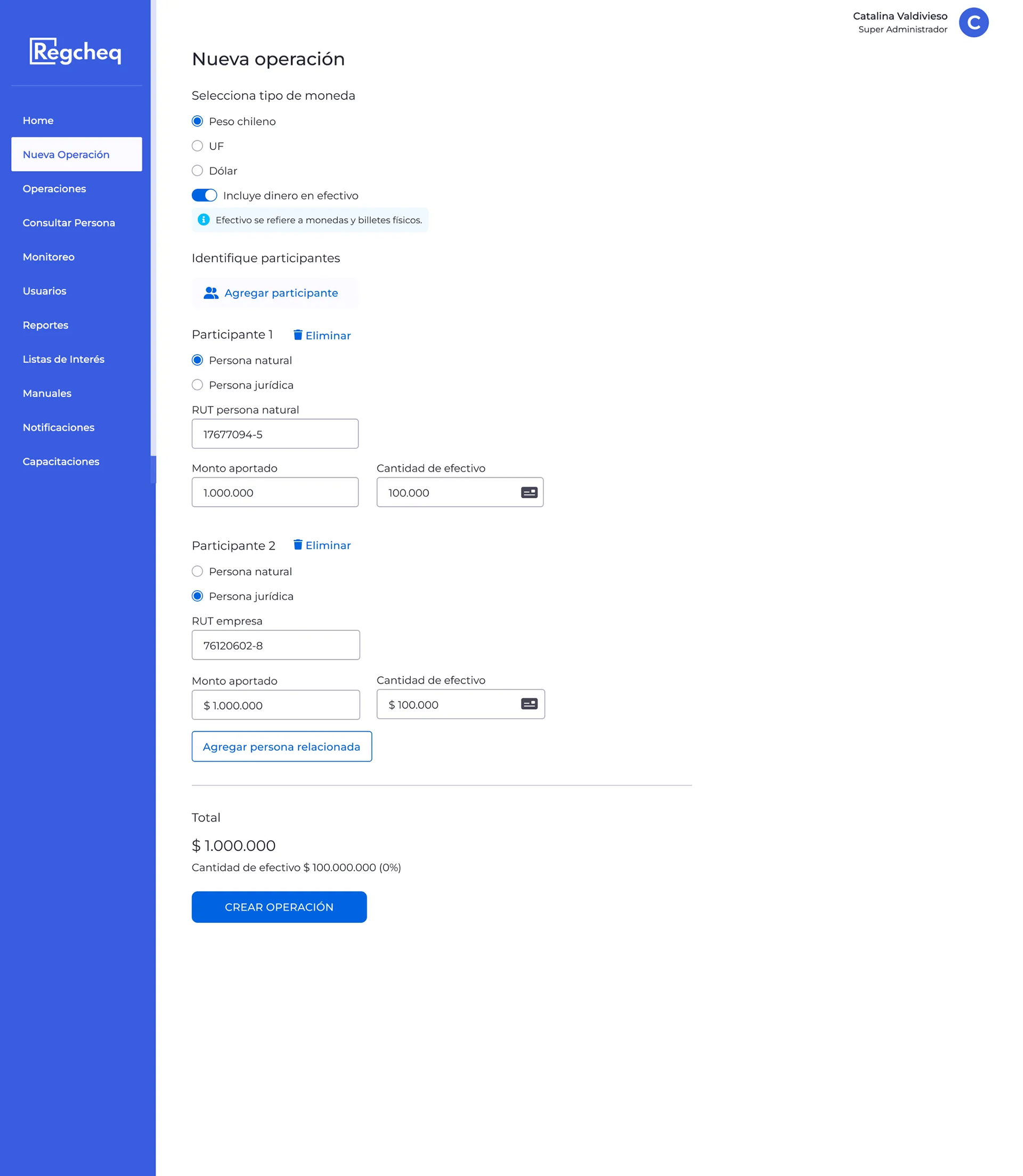
To address these issues, I reorganized the feature into a clearer, two-step process: first, users add participant information; second, they enter the transaction amount and select the currency. Analysis of user sessions showed that the original currency order was confusing, so I reordered the options based on actual user behavior, prioritizing Peso Chileno – UF – USD Dolar
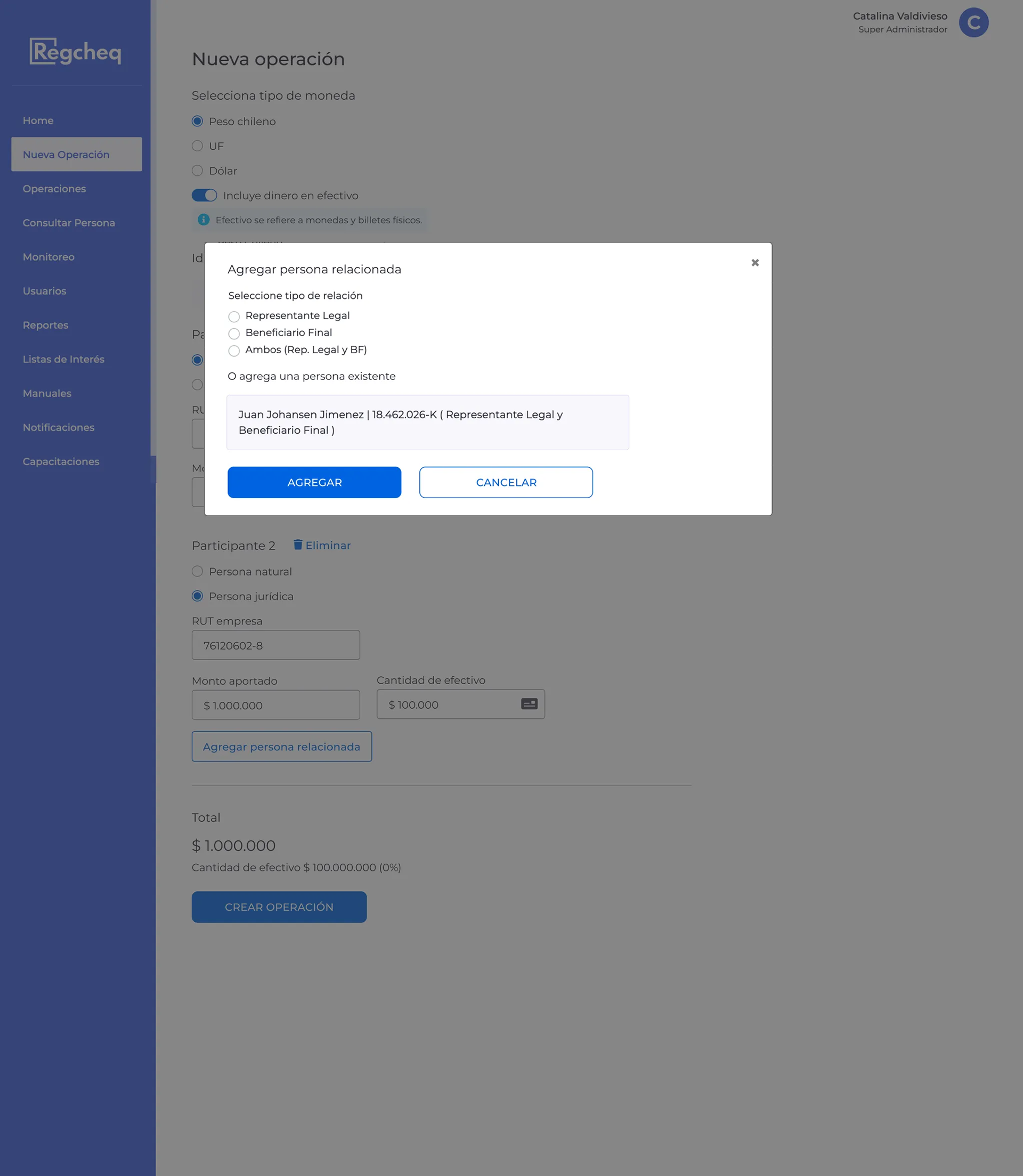
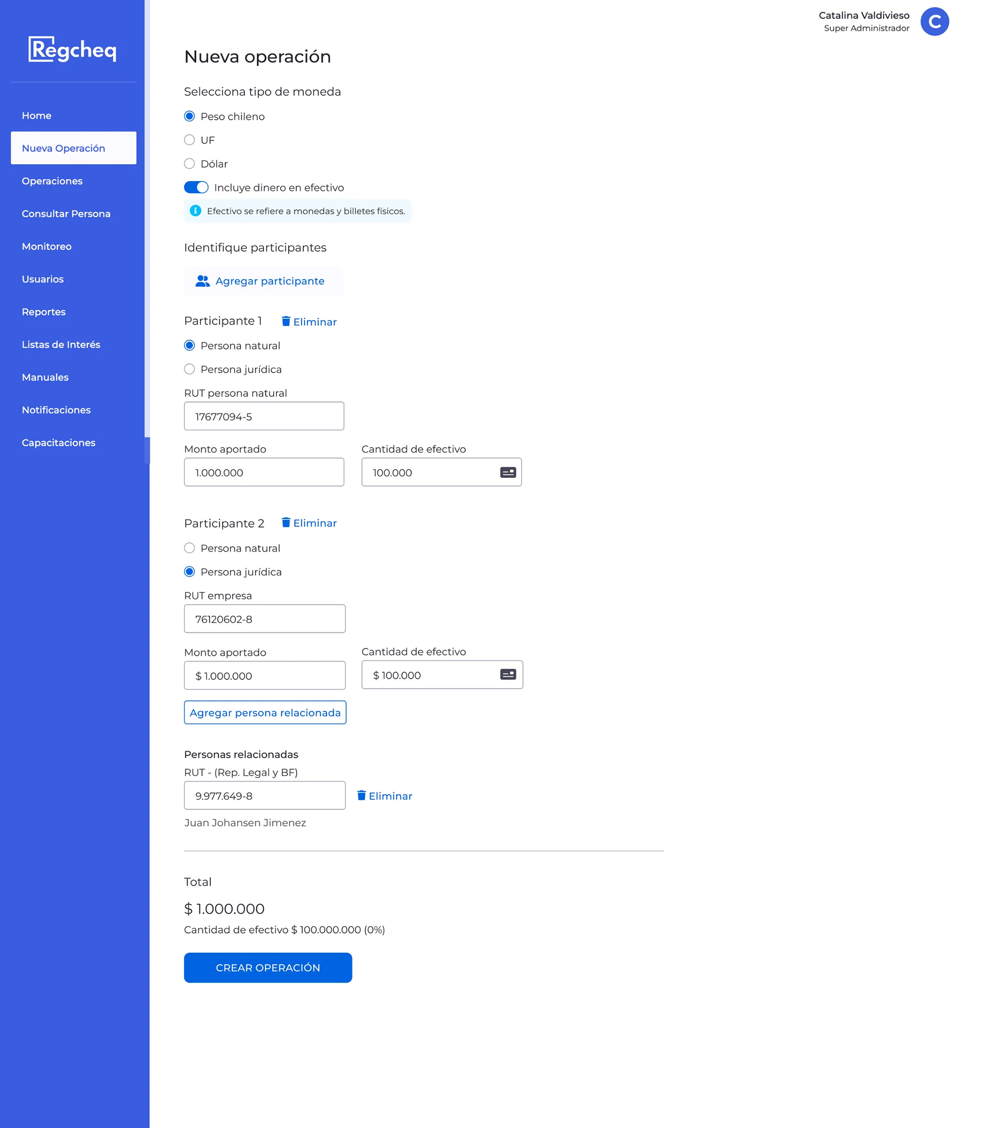
The “Involves Cash” switch was moved, and its label was updated to clarify that it refers to physical money. For legal participants, I suggested merging two redundant links after the participant’s ID, as both pointed to the same information. In the redesigned modal, users can add a new related person. If the legal participant had previous transactions, the related participants and their details would be displayed.
Mockups New Transaction
Natural participant.
Two participants.
Legal participant.
Modals of related people.
Data comparison after production release
Comparing data before and after the redesign confirmed the effects of these changes. Previously, the development team had only made small fixes in response to client complaints, rather than addressing core usability issues. After the redesign, the ranking of top user actions shifted, showing that the “Involves Cash” switch, which was once a common source of errors, was no longer a critical step. Moving this field resulted in a 79.54% decrease in clicks, dropping from 303 to 62.
Additionally, reorganizing the information and changing the order of currency input improved the user flow, boosting both efficiency and usability. Datadog’s analytics and session replay tools were essential in finding friction points, confirming design choices, and measuring the success of the redesign.
Data with old design.