Streamline the pledge-taking process to enhance participation for Macal users, who specialize in online auctions.
An auction platform requires users to pay a fee to participate and purchase items, unlike e-commerce platforms, which typically charge a fee for shipping and handling.
Context
Macal is a Chilean auction house founded in 1982, specializing in the sale of cars and real estate. In 2021, it transitioned to online auctions, which posed challenges regarding participation pledges and raised concerns among regular clients compared to previous live auctions.
The website's outdated design necessitated modernization, prompting the company to update its functionality, as it serves as the primary entry point for auctions. Many customers found the process confusing due to industry-specific jargon, often requiring assistance from the support center, resulting in lengthy customer service calls.
The initial payment required to participate in an auction is referred to as a "pledge." If a customer successfully purchases a car or real estate, the pledge is deducted from the total payment.
Research and Discovery
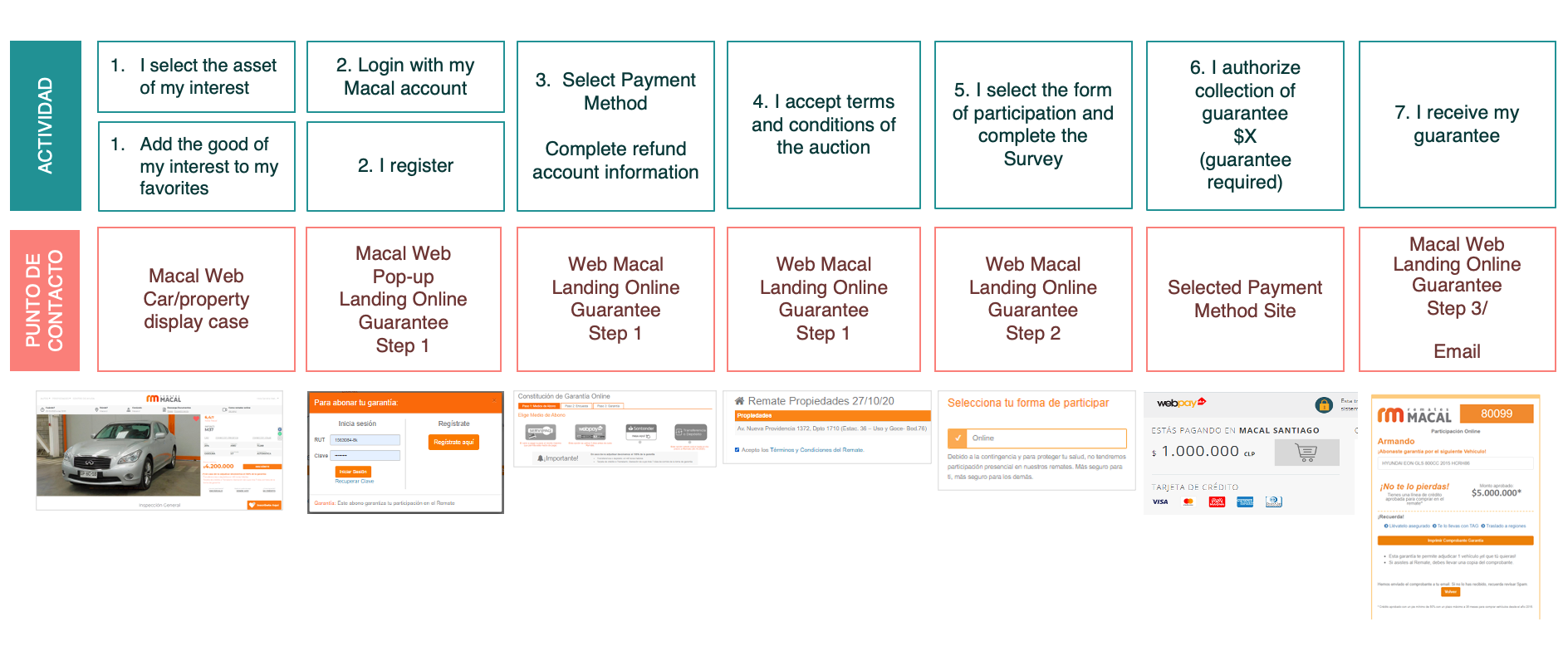
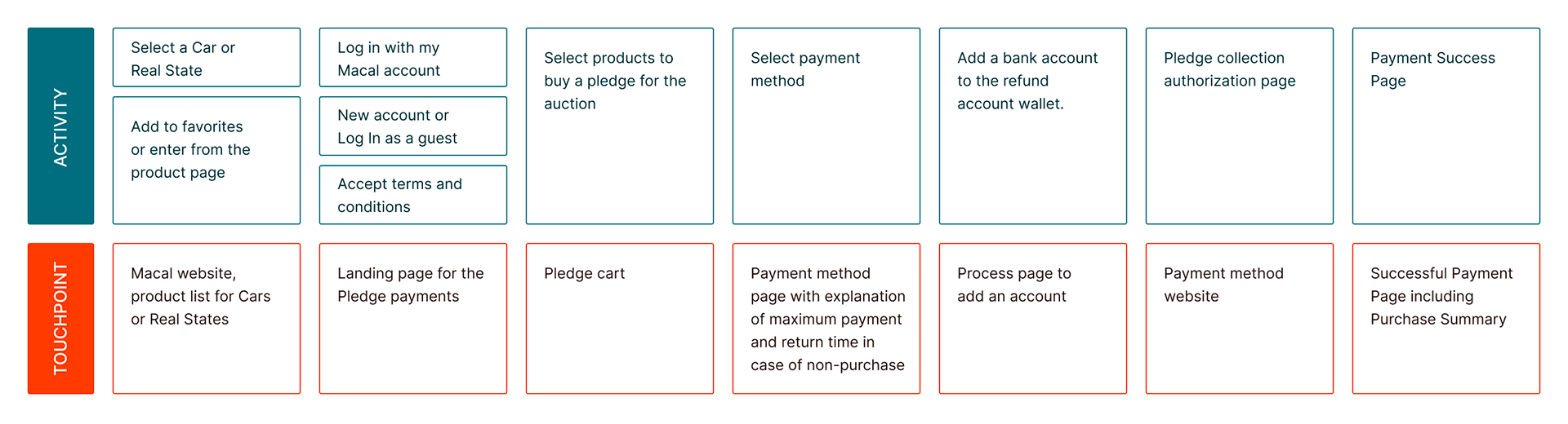
Customer Journey
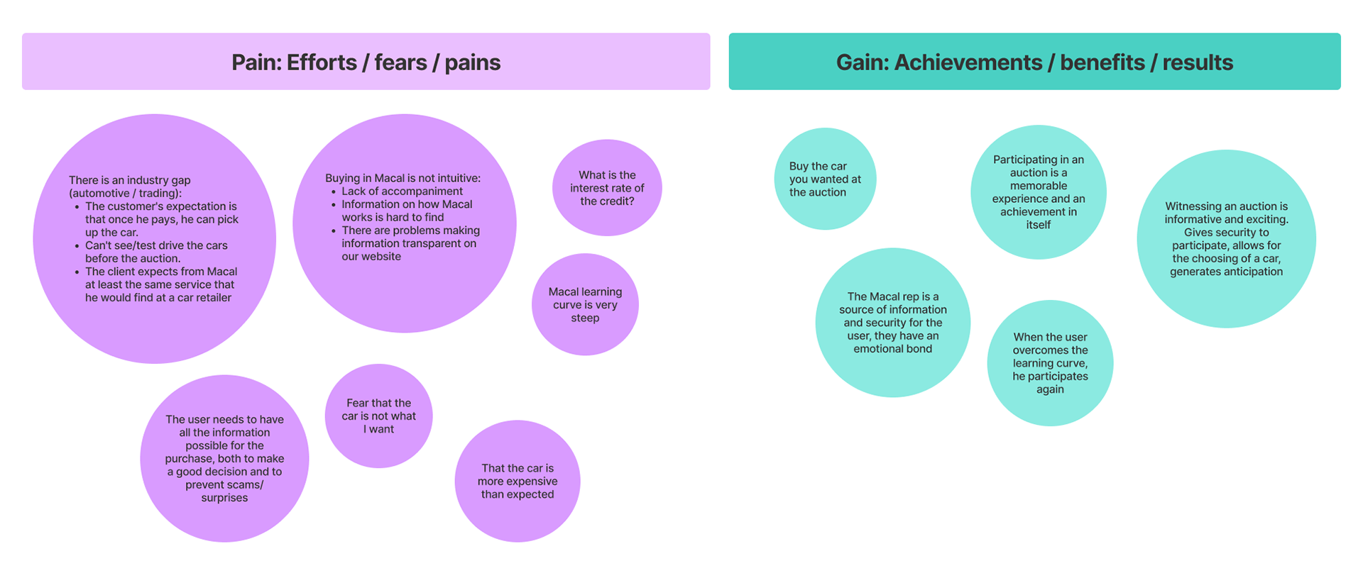
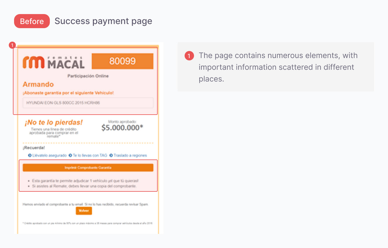
The previous process had several user challenges. First, requiring users to log in or create an account was a barrier to entry. During payment, a disruptive pop-up requested refund account information. Users also had to complete an unnecessary survey about how they discovered Macal. Lastly, the success page was cluttered with excessive details, including vehicle specifications, insurance information, and credit options, which caused confusion.
The redesigned process offers a straightforward, narrative-driven journey that guides users through each stage of the auction. This new approach addresses common pain points in digital auctions and follows best practices from various UX case studies.
Old customer Journey
New Customer Journey
New Design Process
Design
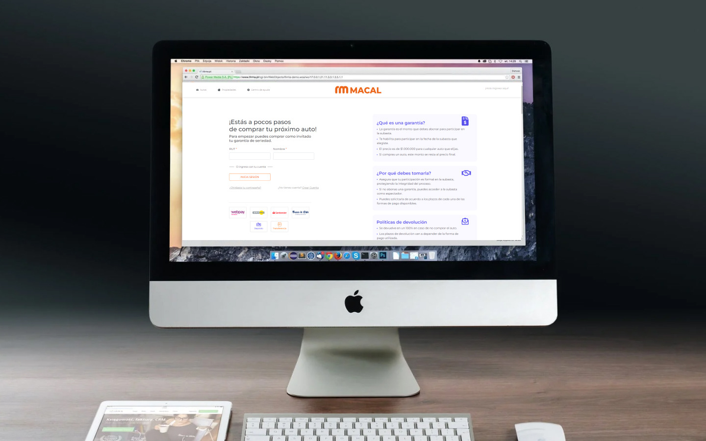
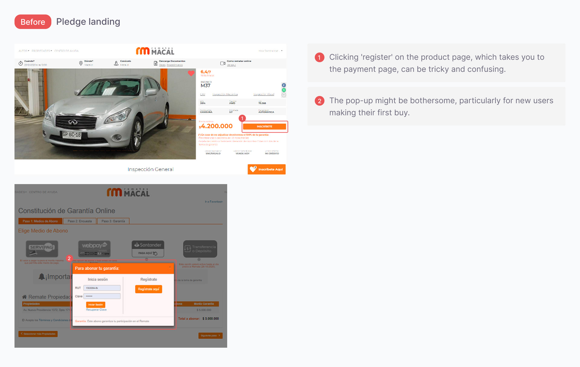
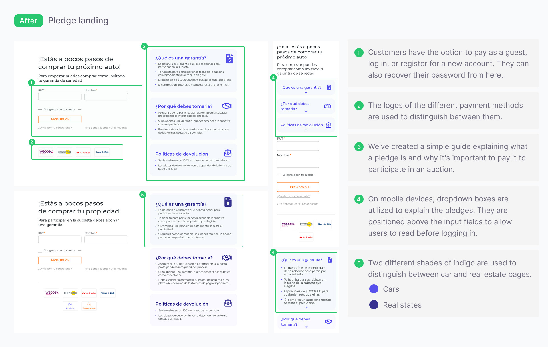
Pledge Landing
A new landing page for pledge payments, for cars and real estate, clearly explains pledges in auctions. Users can log in or enter minimal information, making the process straightforward and reducing confusion, so they can complete actions without interrupting their browsing experience.
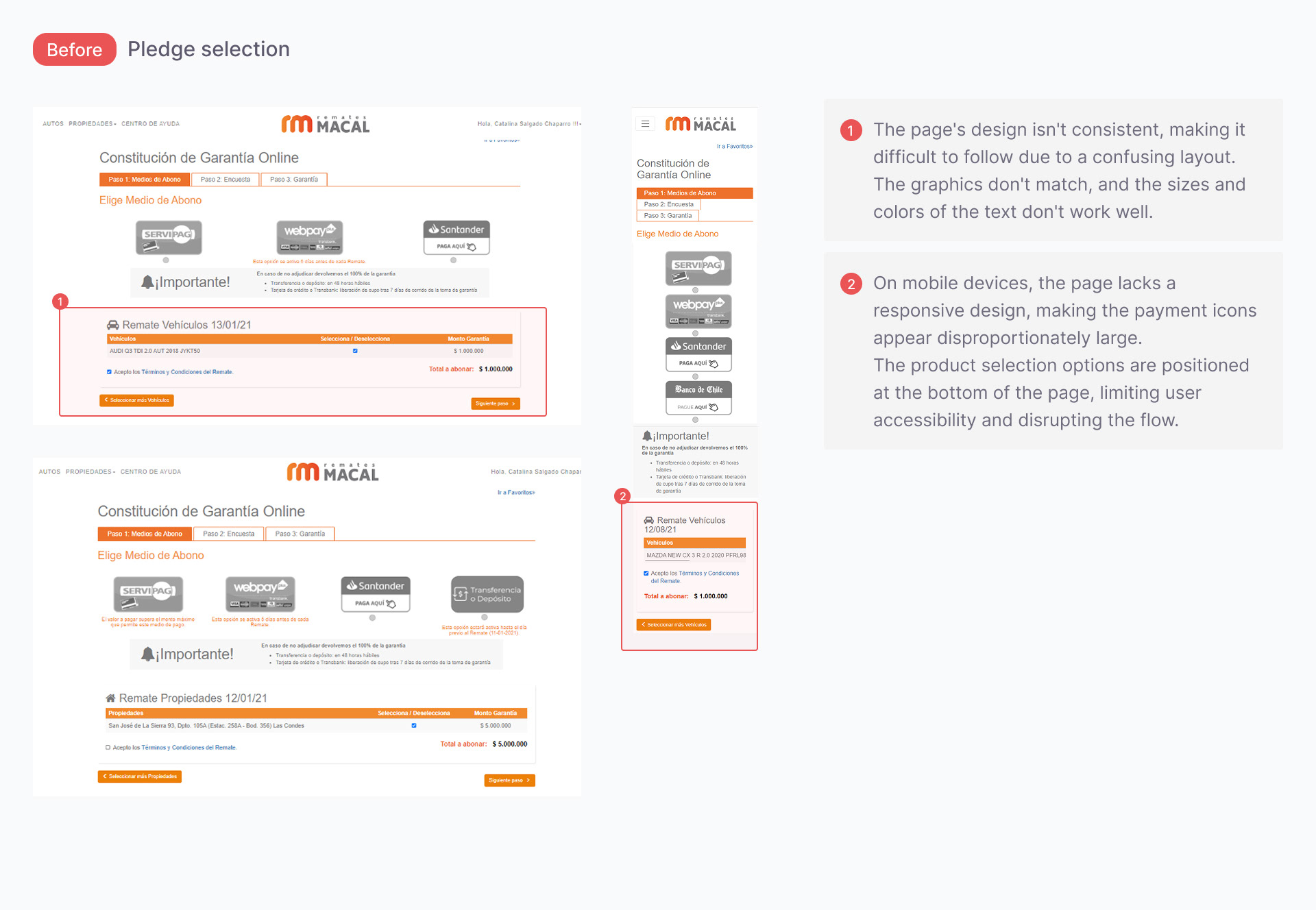
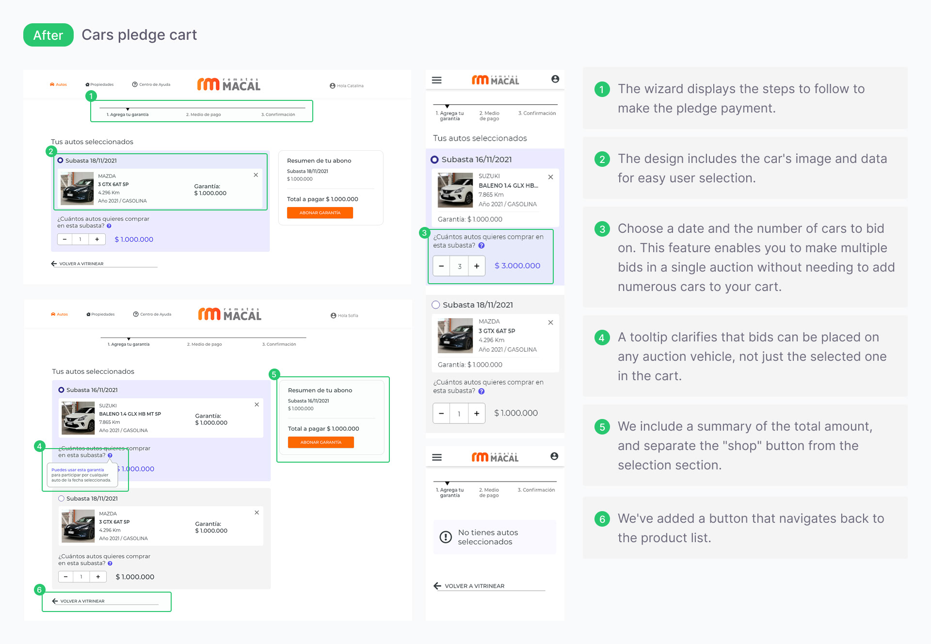
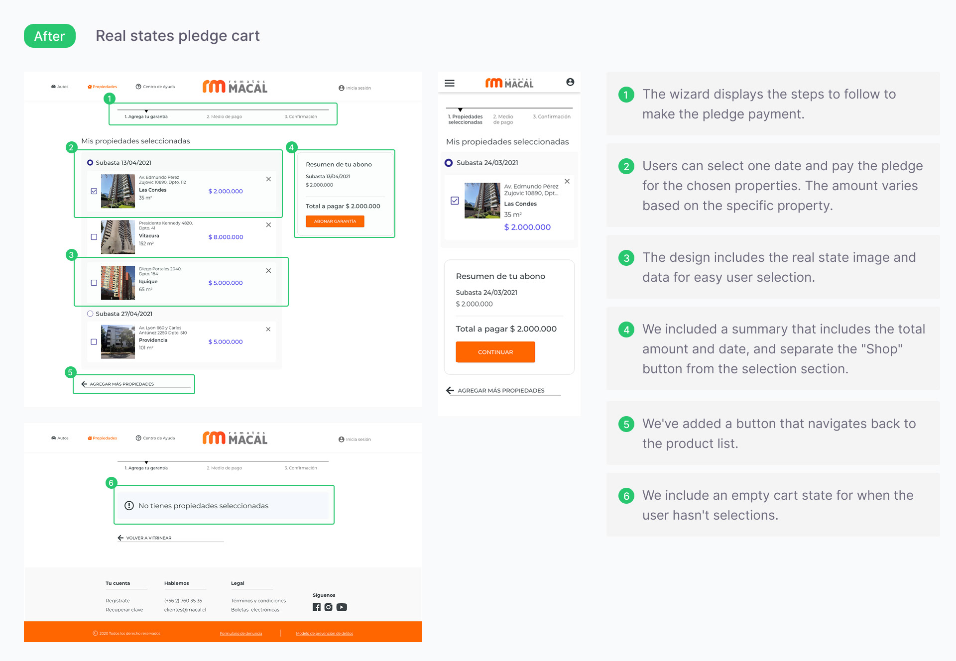
Pledge cart
The "pledge cart" now connects to the user's favorites, making it easier to select items for pledging. This integration creates a seamless transition from browsing to bidding.
We have added a new feature that allows users to pledge for multiple cars instead of just one, which was previously limited to a single vehicle valued at one million Chilean pesos.
For real estate, the process remains the same as each property's price is unique, and pledges are still tied to specific properties.
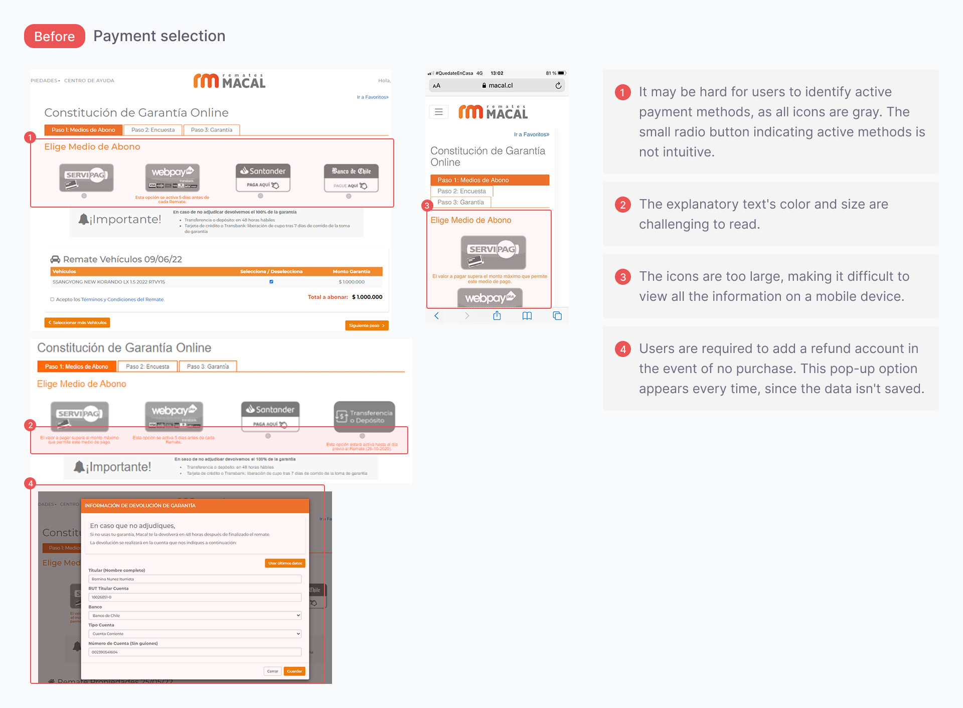
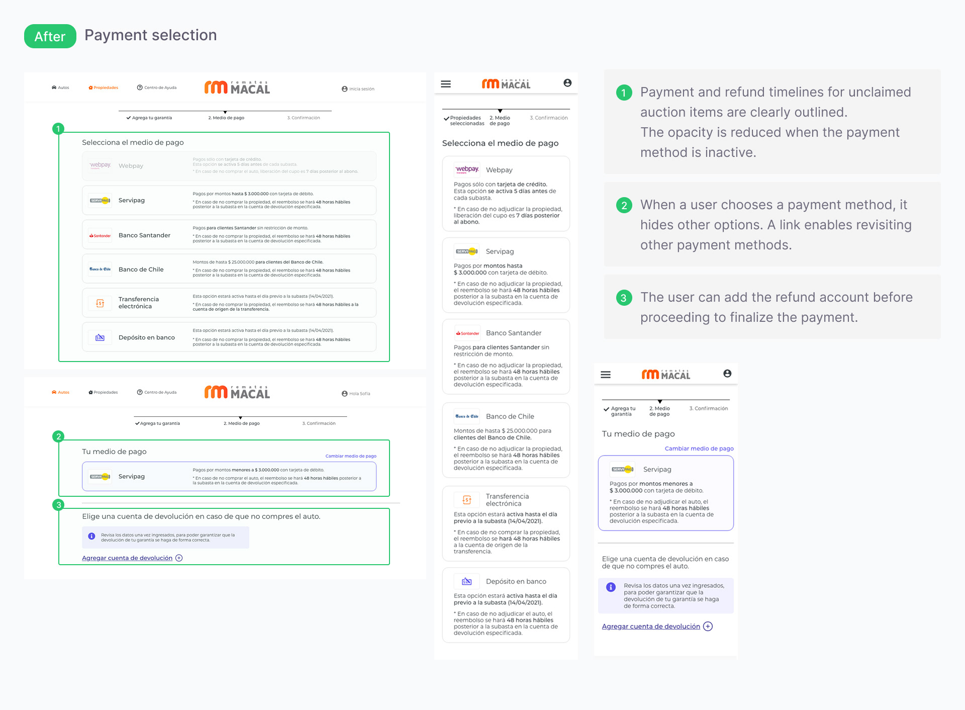
Payment selection
The updated payment methods feature now has clearer visuals to help users. Payment and refund timelines for unclaimed auction items are in one section.
The payment selection process is simpler, with easy instructions for activating options. The redesigned payment method page specifies the maximum payment amount and the refund period for items not purchased.
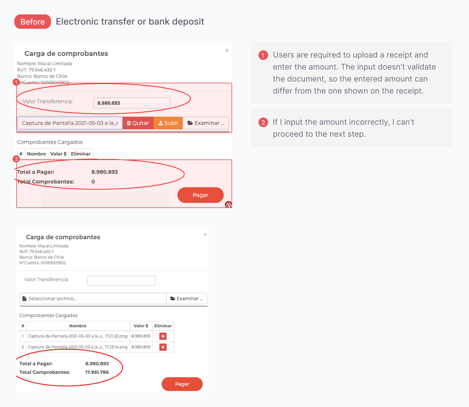
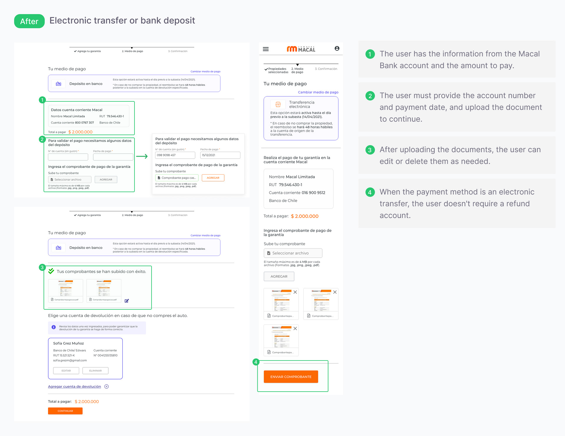
Electronic transfer or bank deposit
To complete the transaction, users must provide the original account number, payment date, and supporting documentation. This information allows agents to efficiently review and verify payments.
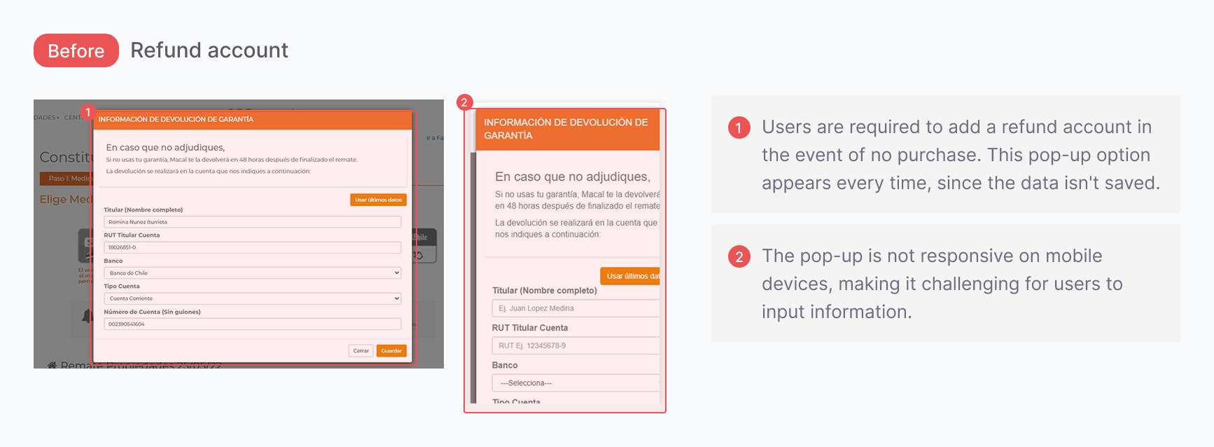
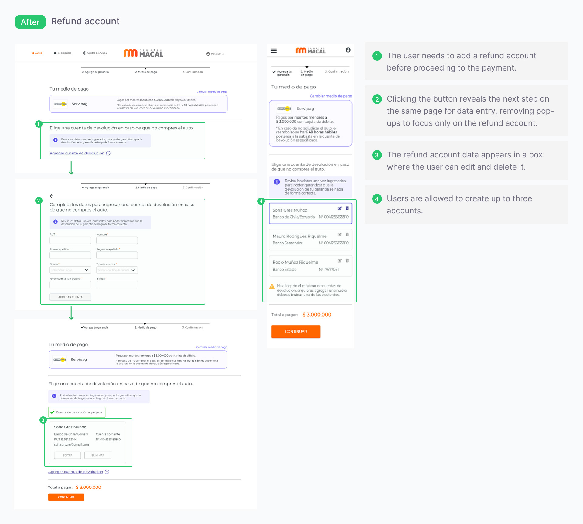
Refund account
Users can store up to three refund accounts in their profiles before making a payment. This feature simplifies refunds, ensuring peace of mind in the event of a purchase failure and enhancing refund reliability. It also allows agents to verify payments more efficiently.
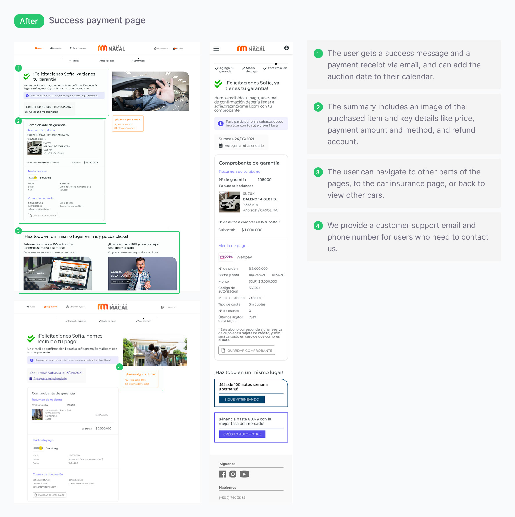
Success payment page
The process ends with separate landing pages for successful and unsuccessful purchases. These pages display payment details and let users schedule reminders for auction day, ensuring a straightforward conclusion to the transaction.
Handoff
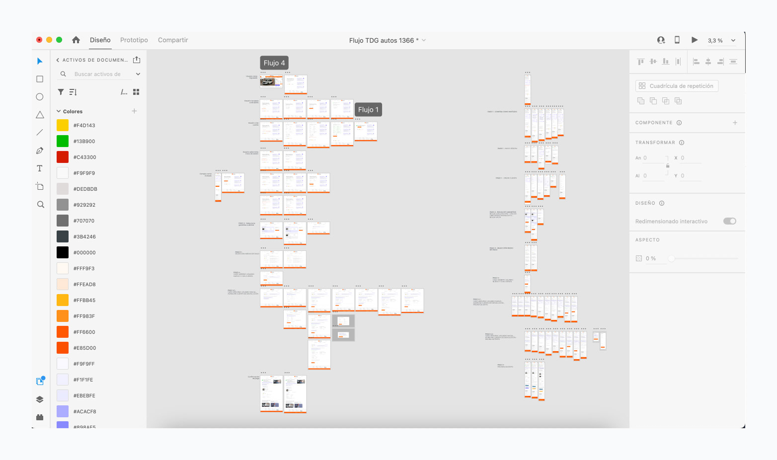
I created handoff documents for the developers that outlined each screen and provided essential context for a smooth transition. The documents included organized user flows for better understanding and were designed for multiple breakpoints: mobile, 1366px, and 1920px screens.
During this process, I worked closely with the development team and emphasized the importance of a clear design handover. I demonstrated each screen individually, as animations were often missed and did not effectively communicate the intended interactions.