My Role: Lead Product Designer
Regcheq is a SaaS transaction-monitoring platform that enables clients to track transfers and deposits, analyze customer activity, and reduce false-positive alerts.
I led the redesign of a core feature to enhance usability, ensuring a smooth transition from outdated patterns to a more intuitive experience.
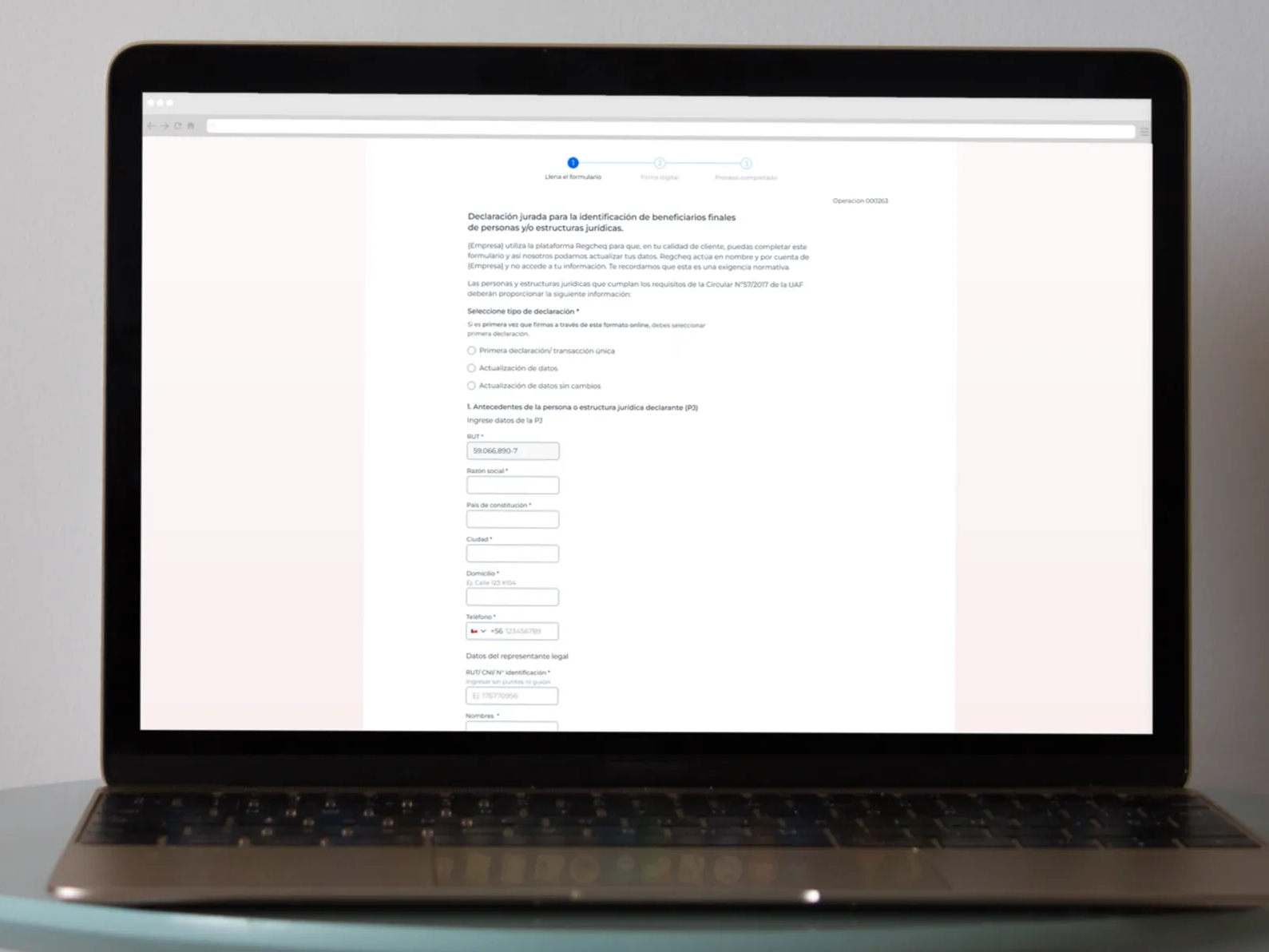
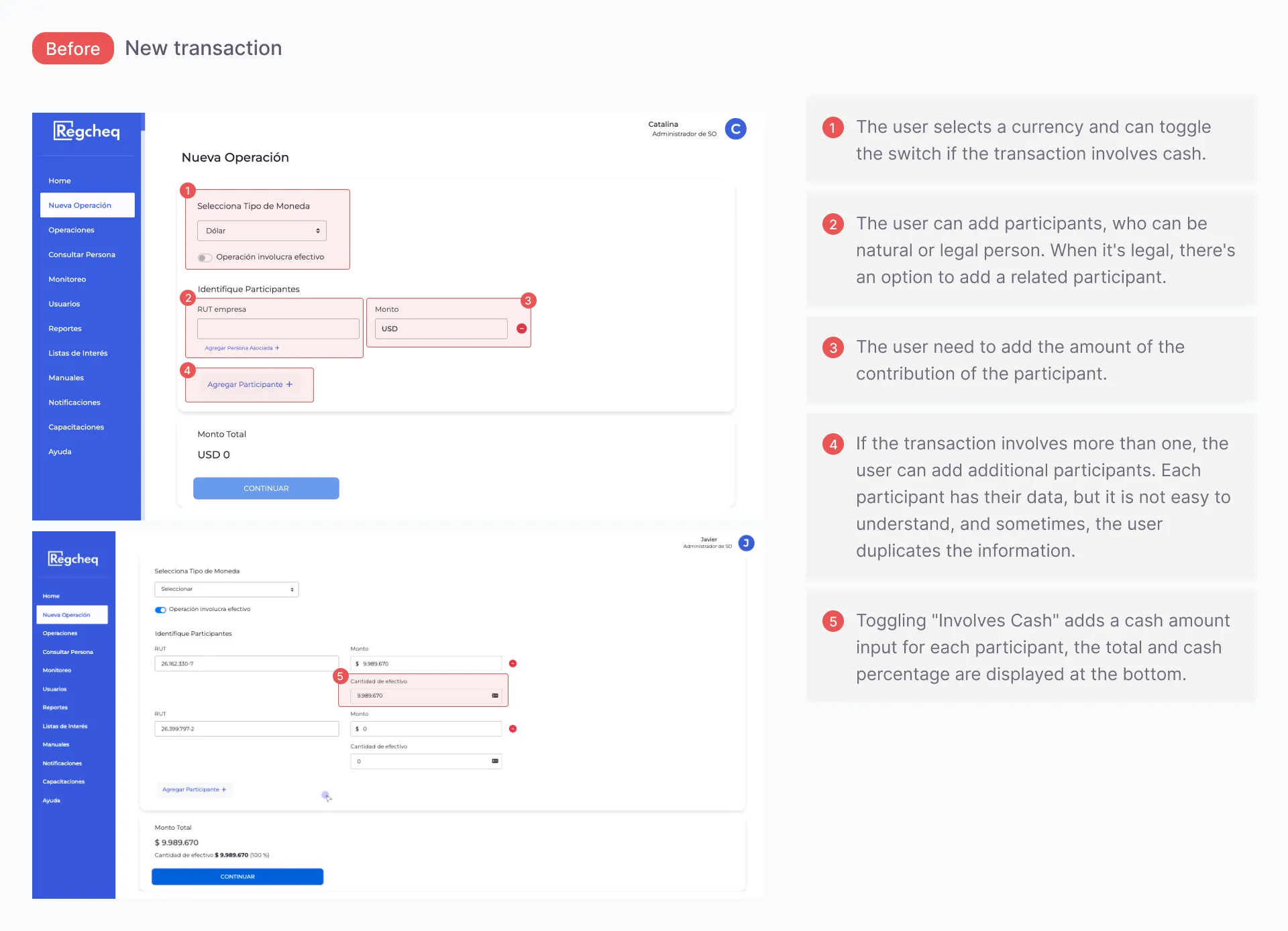
The New Transaction module was old and error-prone, and the information users needed to complete it was unclear; the layout didn't guide them through the correct sequence of actions.
I spearheaded the redesign of Regcheq’s IT workflow, aligning user needs with business priorities and improving overall usability.
Current State of the Product
• When an error occurred during data entry, users could not correct it themselves because the transaction record was locked after submission. They were unable to edit or delete existing entries, meaning that any mistakes required them to restart the entire process.
• Fixing or correcting a mistake required manual intervention across two teams: the Customer Experience team, responsible for identifying the account and flagging the issue, and the Development team, which made the necessary corrections directly in the backend.
• This was particularly critical because the data involved, such as the transaction date and amount, had to be precise. In a compliance context, inaccurate records are not just inconvenient; they pose legal and regulatory risks.
• The arrangement of information in the transaction flow often led to unintentional user errors, disrupting the smooth process of entering new transactions.
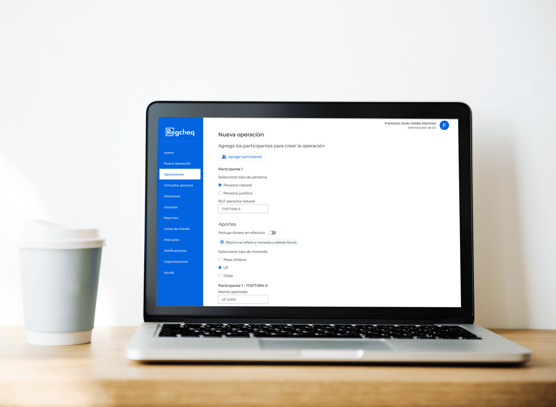
• Users had different options depending on their participant type and whether the transaction was cash-based. Legal participants had more options than natural persons.
Goal - Redesign the transaction feature to reduce friction, prevent errors, and create a smooth, intuitive, and efficient flow.
Research & Discovery
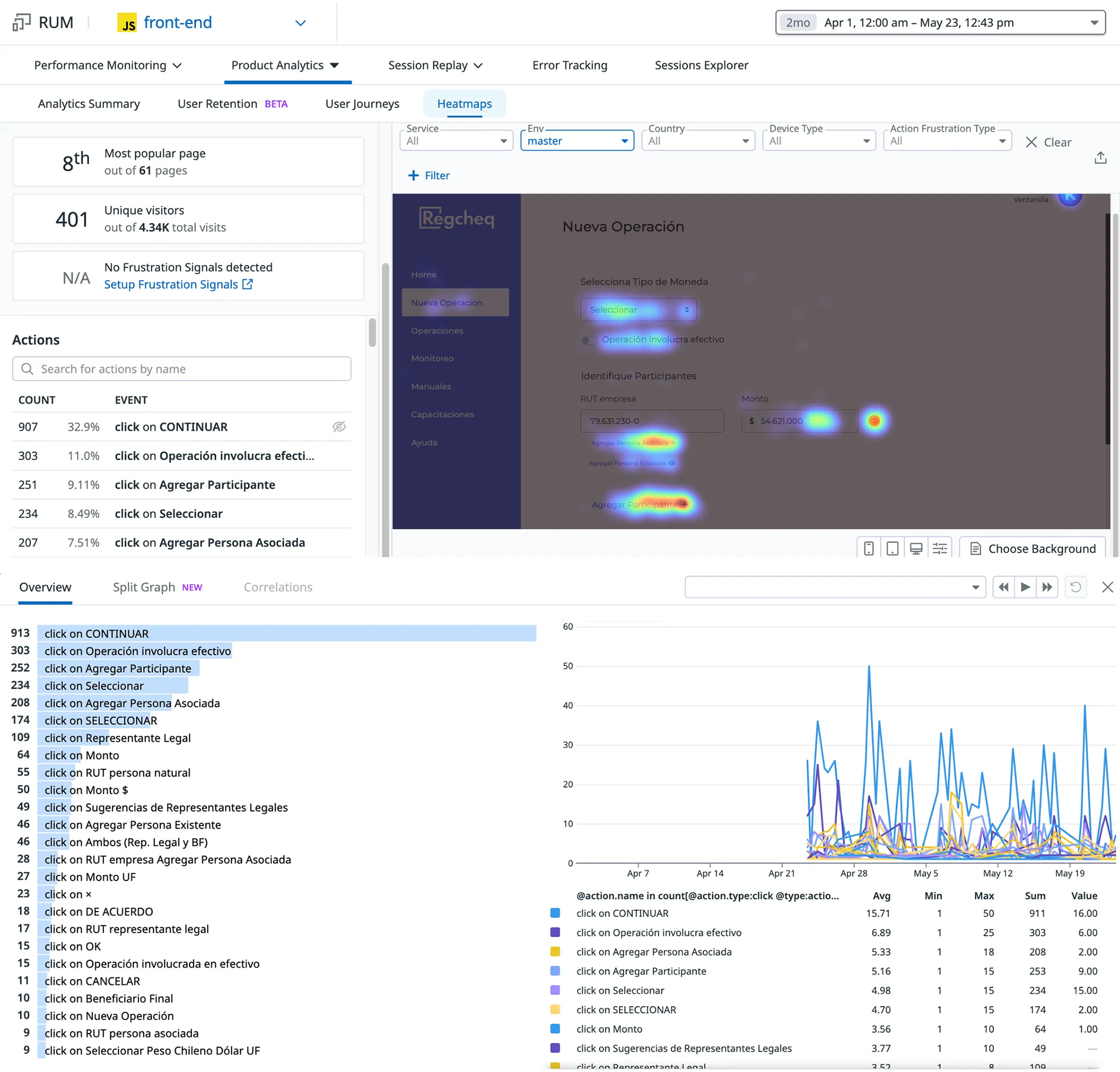
• Analyzed user session replays, heatmaps, and click patterns using Datadog RUM (Real User Monitoring).
• Conducted interviews with Customer Success and Sales teams to identify user pain points and technical limitations.
• Interview the development team and other stakeholders to gain insight into how the feature was designed and defined.
• Performed hands-on walkthroughs to observe friction points firsthand, such as confusing input layouts and poorly labeled switches.
Datadog analytics. The data revealed that the most frequent user actions weren't aligned with the intended workflow. Session replays revealed users struggled to understand the steps and design elements.
The "Involves Cash" toggle kept activating, even though cash transactions were rare; most were digital. Its position, right below the amount field, made accidental activation almost inevitable.
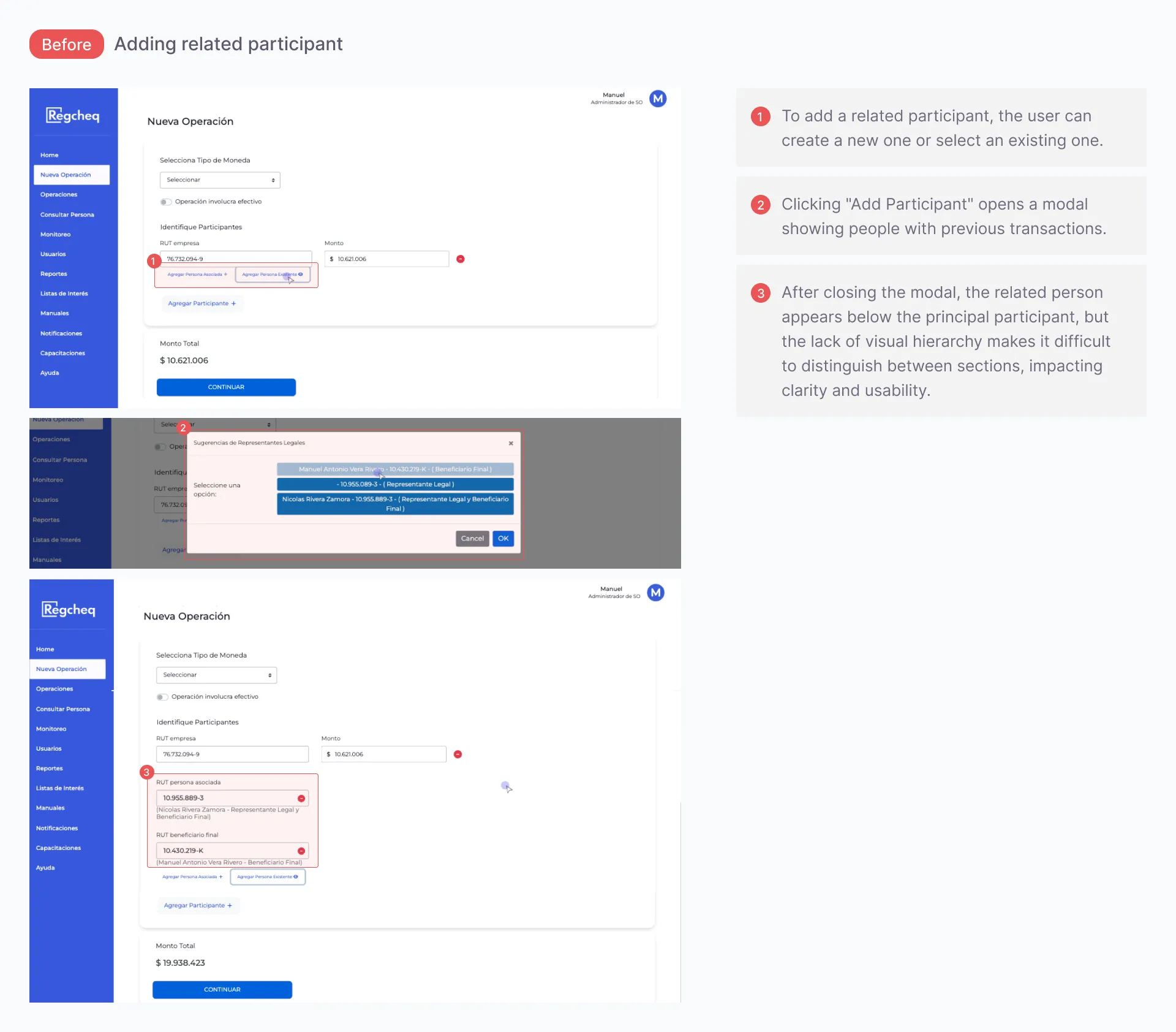
A significant usability issue arose with the interaction involving input fields when adding a participant. The layout of these fields was unclear, leading to frequent user mistakes. The concepts were confusing, and the input field sequence did not clearly indicate the correct sequence of actions.
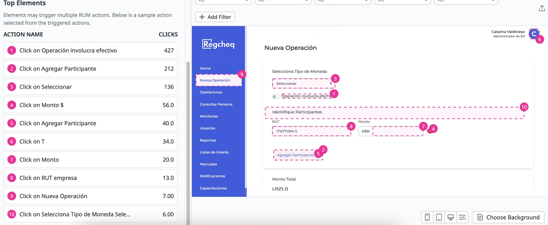
Top user actions.
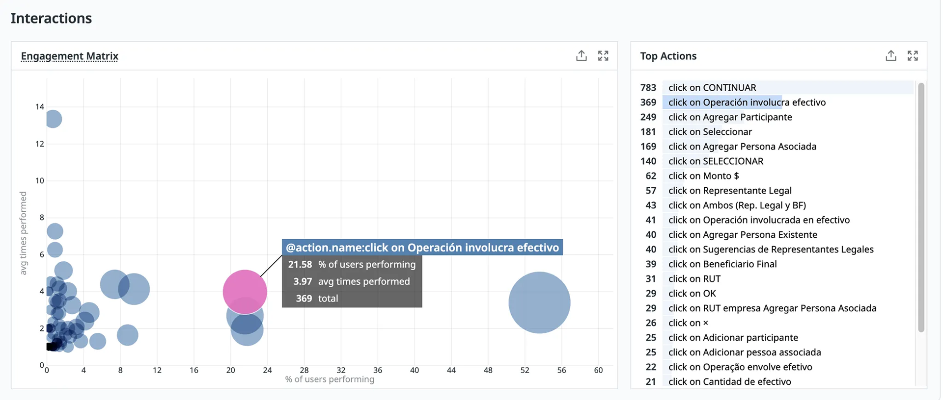
The interaction matrix of the top action.
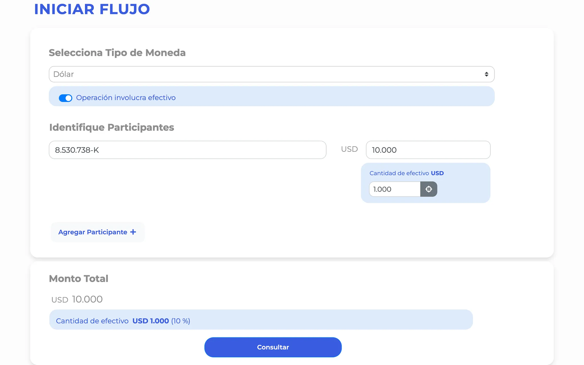
Final Design
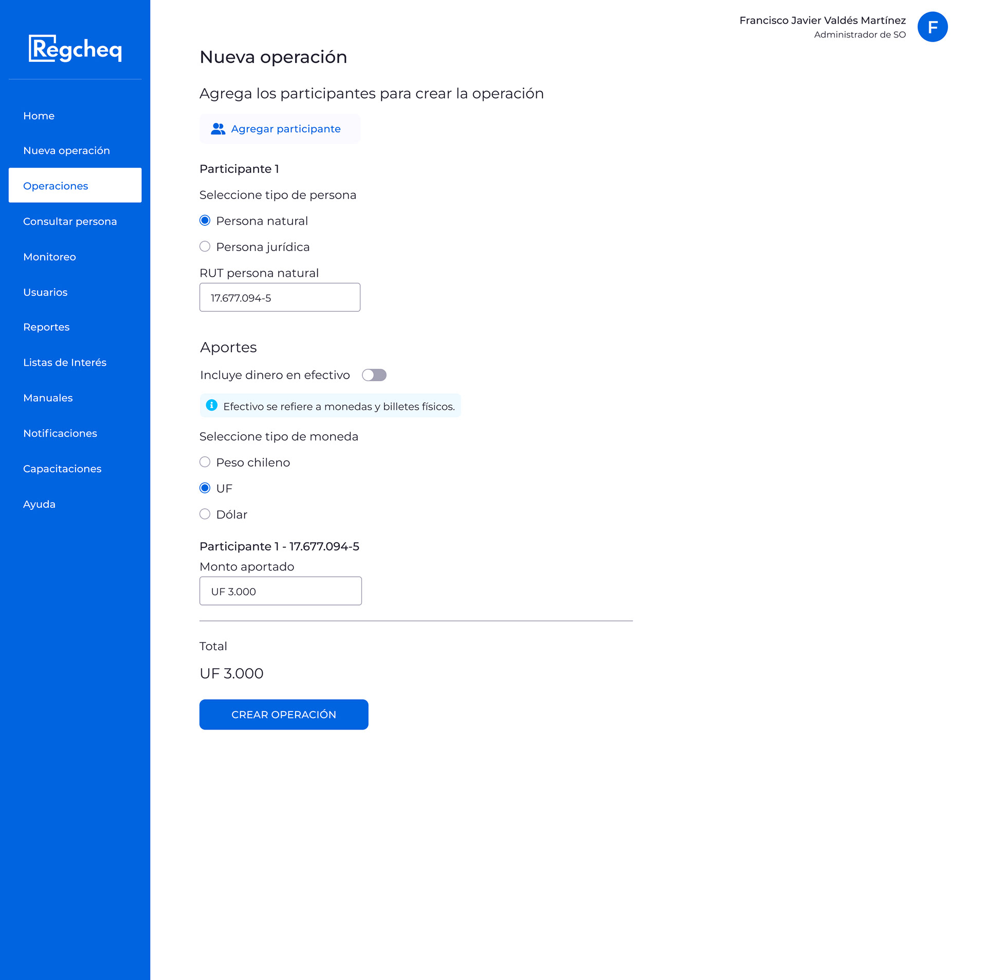
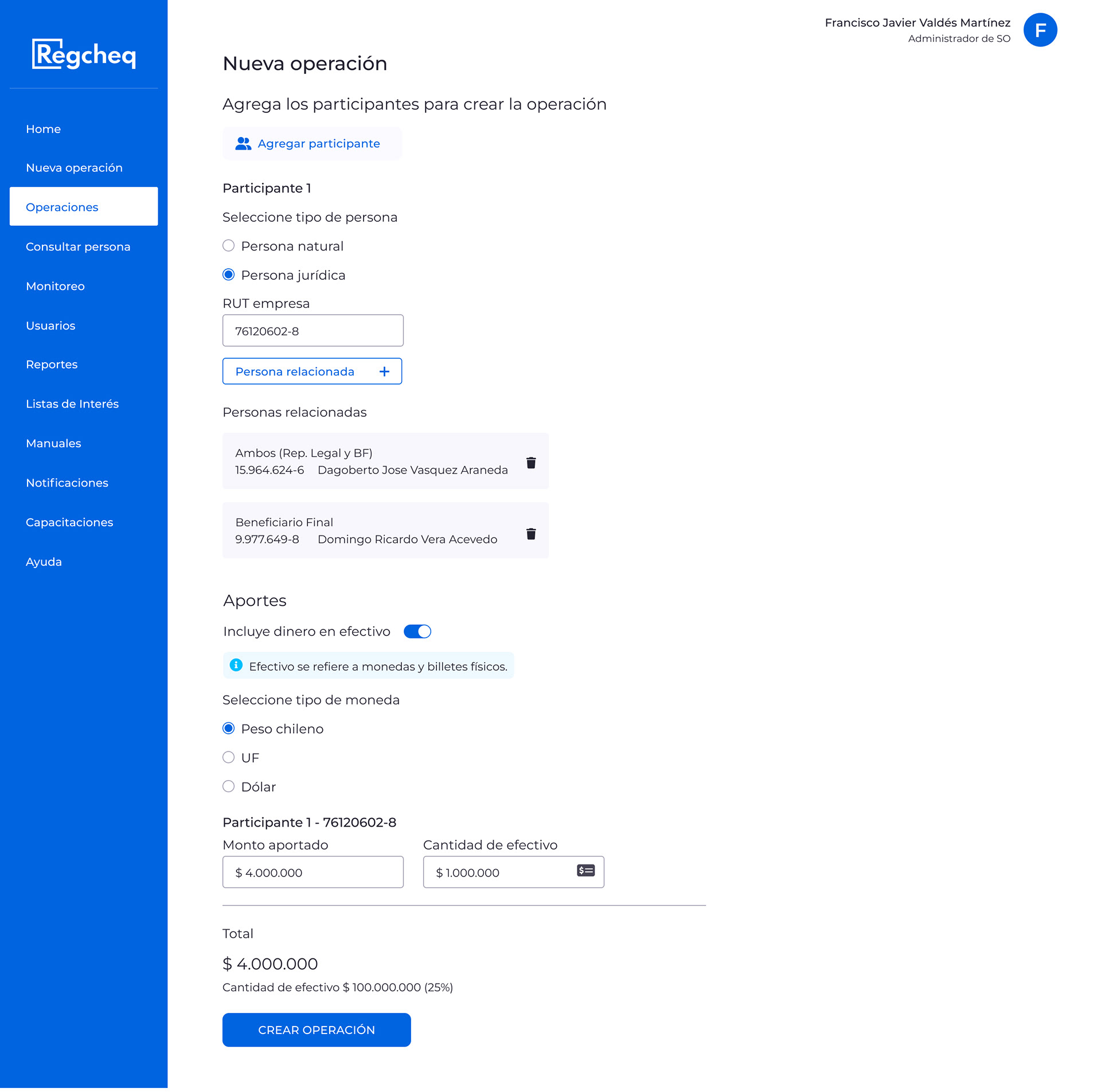
Structured Two-Step Workflow
Participants and transaction details are added separately for better clarity
Participants and transaction details are added separately for better clarity
Reordered Currency Options
Currencies are organized based on their frequency of use. It reflected how users actually worked.
(Chilean Peso → UF → USD)
Currencies are organized based on their frequency of use. It reflected how users actually worked.
(Chilean Peso → UF → USD)
Relocated & Relabeled “Involves Cash” Toggle
This toggle has been moved to prevent accidental activation, and its purpose has been clarified
This toggle has been moved to prevent accidental activation, and its purpose has been clarified
Improved Participant Interactions
We have added delete icons, merged redundant links for legal participants, and enabled the option to add related contacts.
We have added delete icons, merged redundant links for legal participants, and enabled the option to add related contacts.
Visual Harmonization
We created a UI library with a clean typographic hierarchy, consistent button styles, and a restrained color palette to improve visual coherence.
We created a UI library with a clean typographic hierarchy, consistent button styles, and a restrained color palette to improve visual coherence.
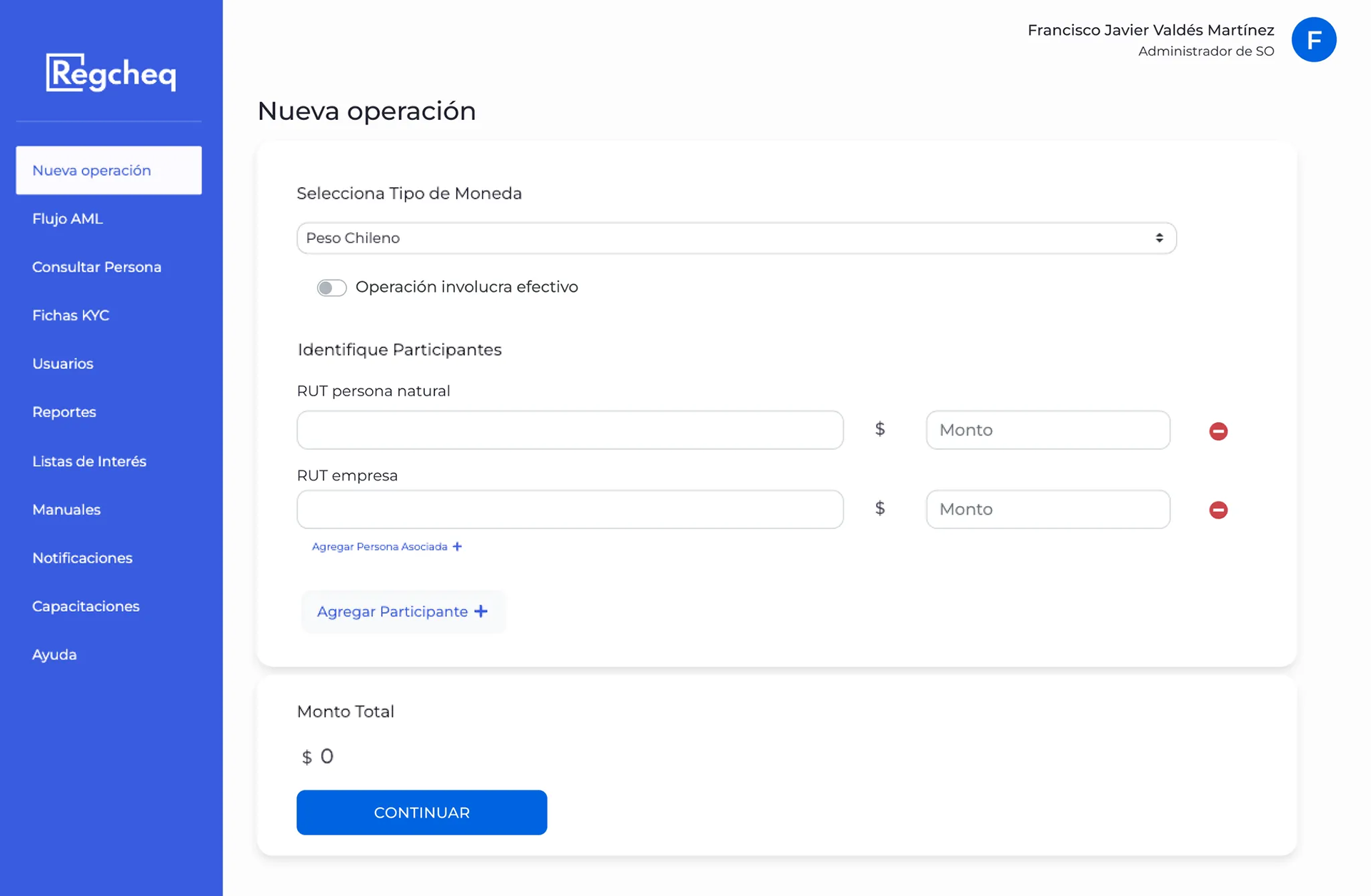
Final Design Natural Participant
Final Design Legal Participant
Visual changes
The software had an outdated design, poor hierarchy, and misuse of color, resulting in accessibility issues. We made impactful changes using a UI kit, transforming the final design across the entire software.
The UI library includes typography, color palettes, and primary and secondary buttons. I removed unnecessary blue elements and aligned text and buttons to the left. I changed "Iniciar flujo" (Start Flow) to "Nueva operación" (New Operation) and added an icon for removing participants.
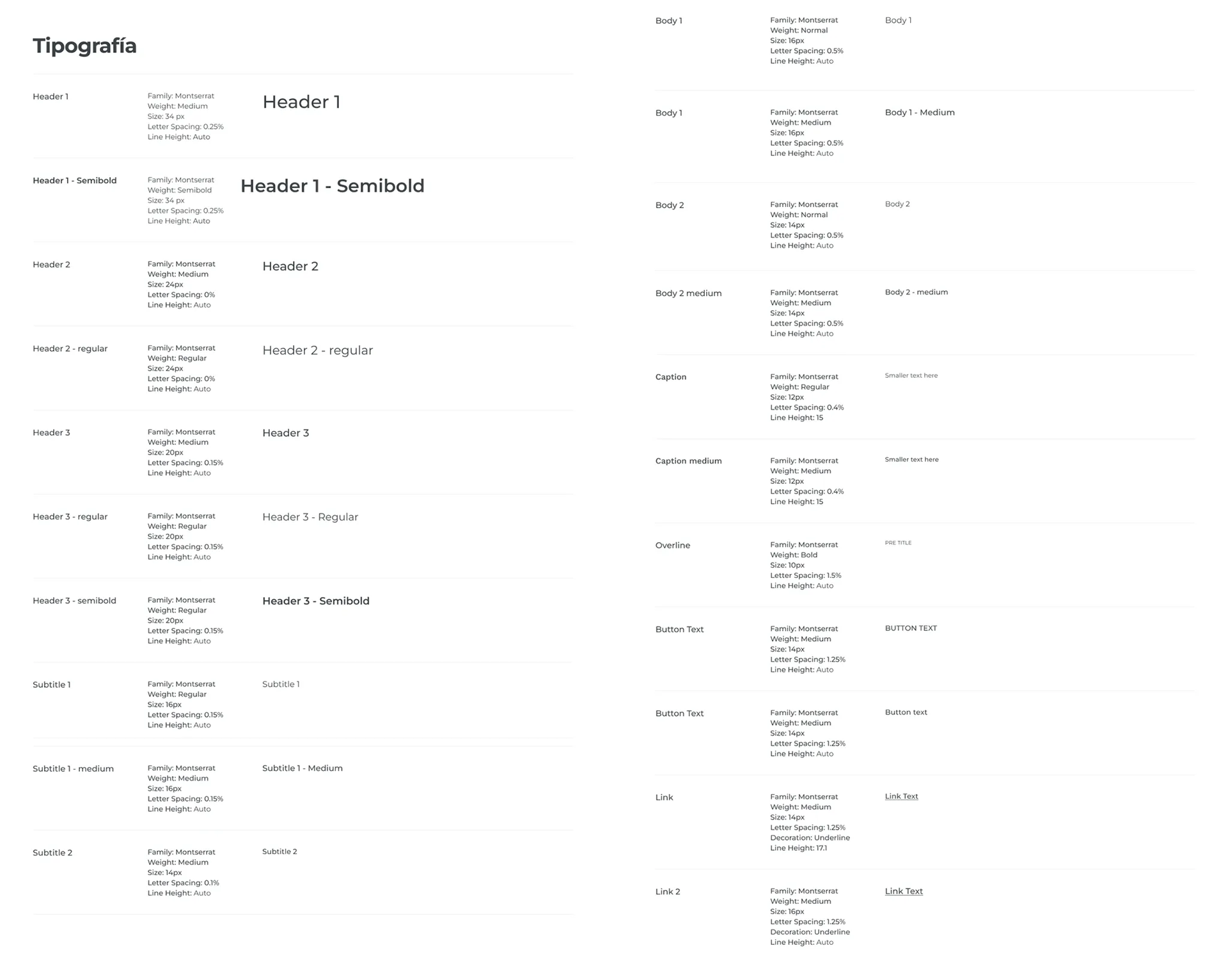
Tipography
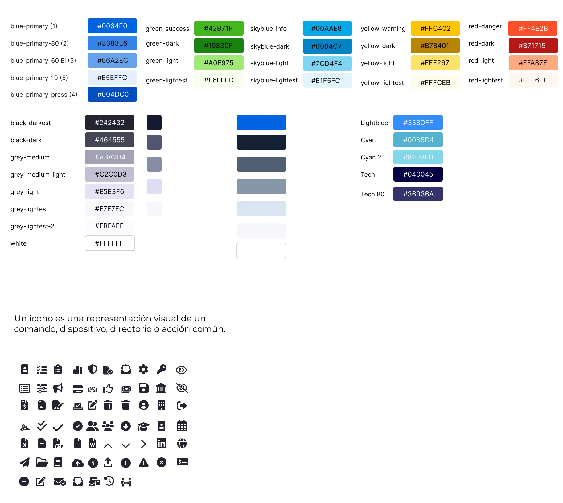
Colors and Icons
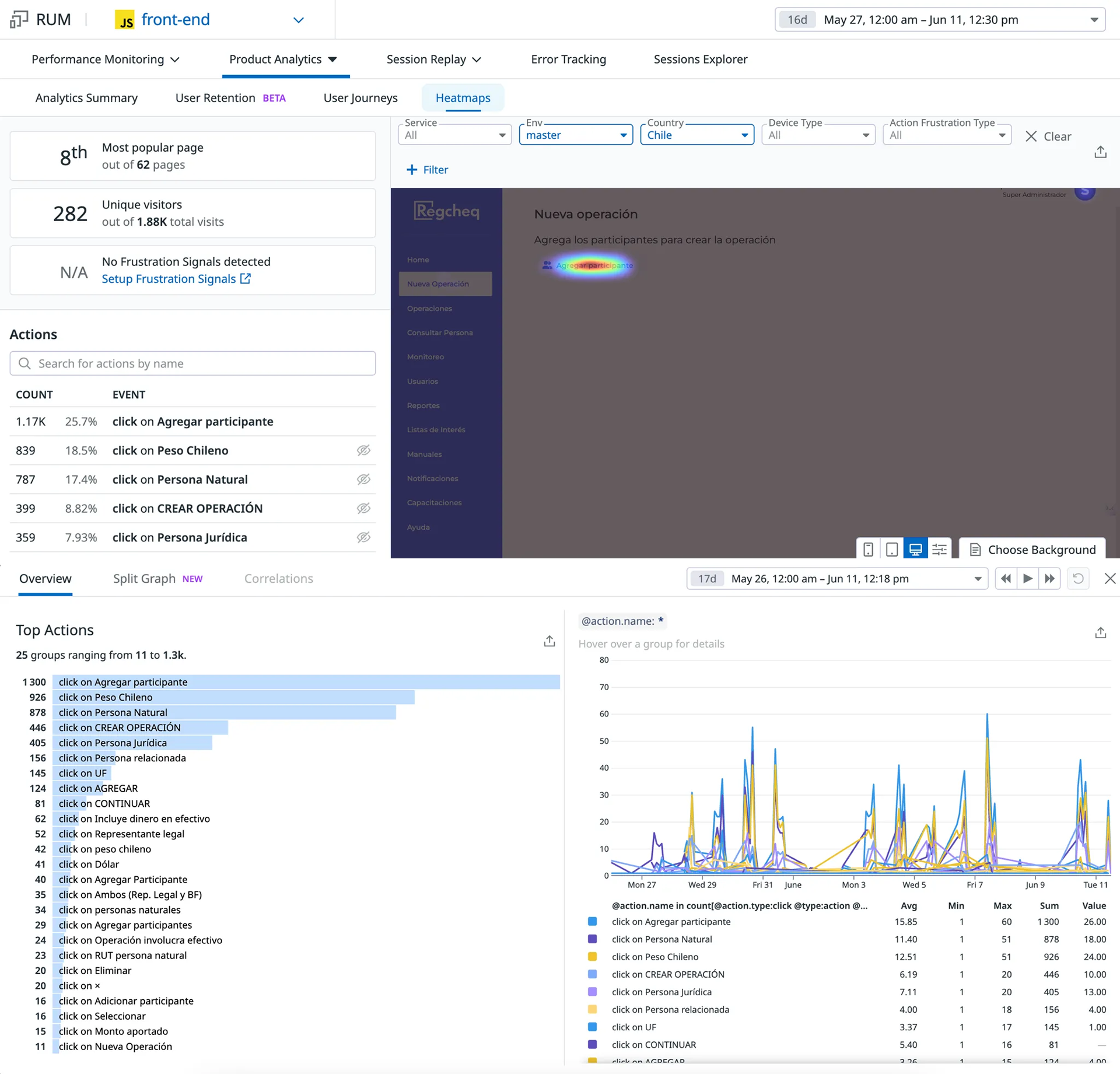
Data comparison after production release
Comparing pre- and post-redesign data confirmed the effects of these changes. Previously, the development team had only made small fixes in response to client complaints, rather than addressing core usability issues.
After the redesign, the ranking of top user actions shifted, indicating that the “Involves Cash” switch, which had previously been a common source of errors, was no longer a critical step. Moving this field resulted in a 79.54% decrease in clicks, dropping from 303 to 62.
Reorganizing the information and reordering the currency input improved the user flow, boosting efficiency and usability. Datadog’s analytics and session replay tools were essential for identifying friction points, validating design decisions, and measuring the redesign's success.
Key Outcomes & Results
• The "Involves Cash" toggle dropped from 303 clicks to 62, a 79.5% decrease. That number tells you how much unintentional friction the old design was generating.
• Streamlined flow increased user efficiency, resulting in a higher percentage of users successfully completing tasks. The volume of support requests has dropped, indicating fewer usability issues.
• Visual enhancements improved clarity and eased cognitive load for users.
• The ranking of top user actions shifted, which means users were now doing what the workflow actually intended, not fighting against it.
Reflections
• Datadog’s analytics and session replay tools proved crucial for quickly uncovering hidden usability issues.
• Collaborating with Customer Success, Tech, and Sales was vital to align user needs with business goals.
• The broader takeaway was that the most impactful changes weren't the visual ones; they were the structural decisions about the order of information and the placement of elements. Those are the things users never notice when they're right, but always feel when they're wrong.
• What I'd do differently: I'd push for field-level analytics earlier, tracking drop-off by specific input, not just overall flow. That would have let us prioritize the redesign more precisely.
Mockups New Transaction Design
Natural participant.
Two participants.
Legal participant.
Modals of related people.