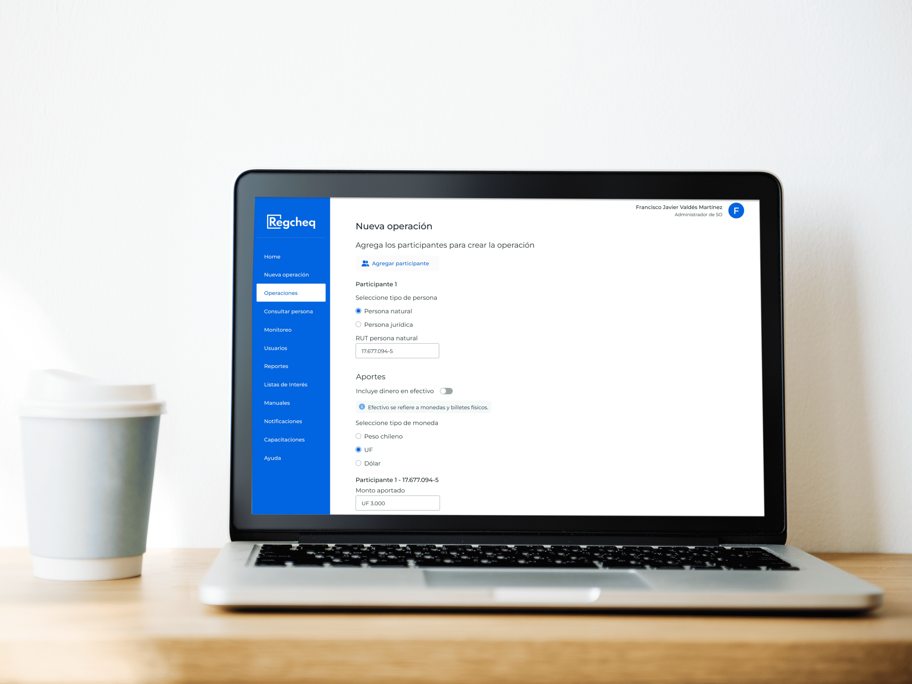
Regcheq is a SaaS platform designed for tracking transactions. It helps clients monitor transfers and deposits, analyze customer activity, and reduce false-positive alerts.
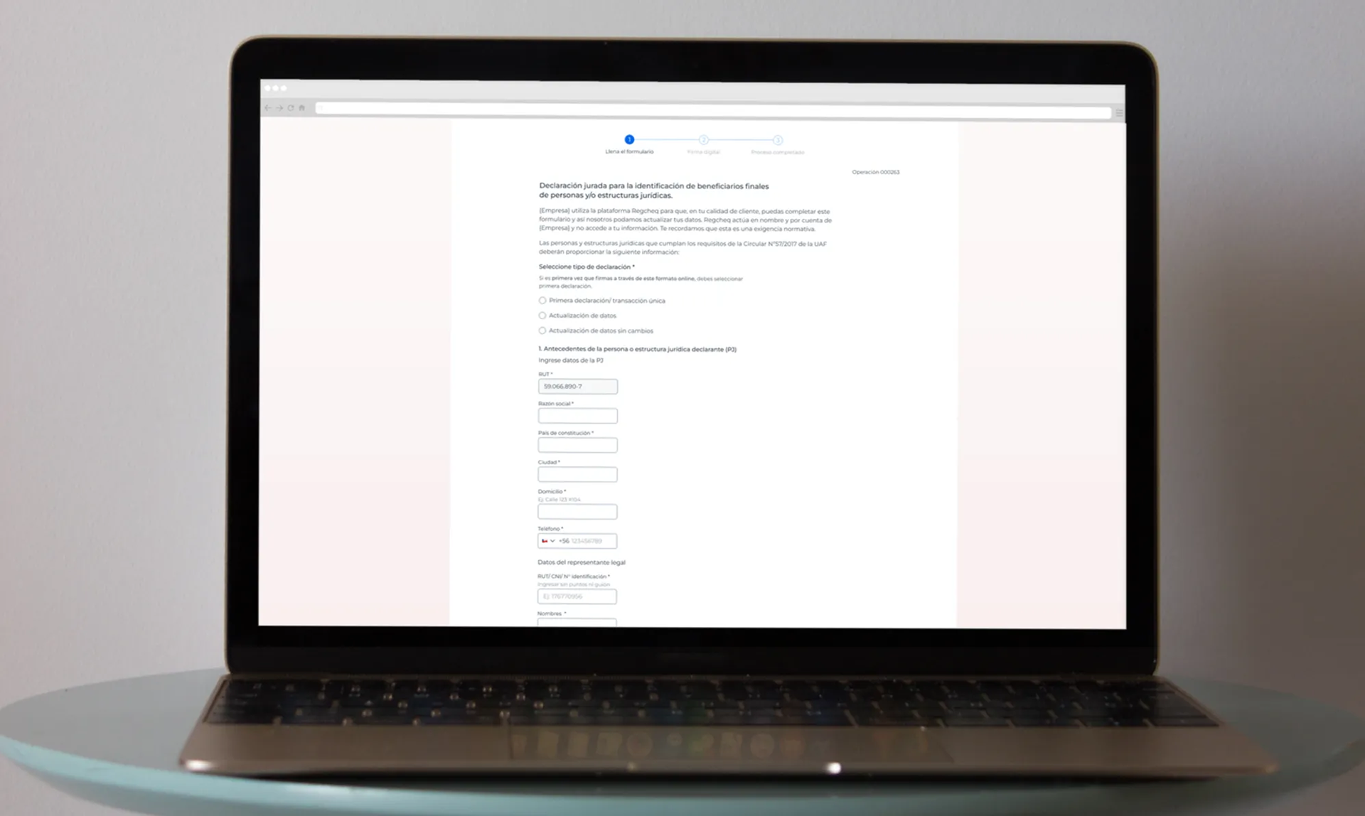
The platform offers digital due diligence forms, including the Declaration of Origin of Funds, the Final Beneficiary Form, and the Politically Exposed Persons form.
My Role: Lead UX/Product Designer
I led the redesign of the Final Beneficiary form used in Regcheq’s due diligence platform, collaborating closely with the Product Owner, compliance team, developers, and end users to simplify a legally dense workflow and improve completion rates.
Challenge
• The form was legally complex and hard for non-experts to complete accurately.
• Iterative, uncoordinated changes by stakeholders, the Product Owner, and the bank resulted in inconsistent goals and unpredictable outcomes.
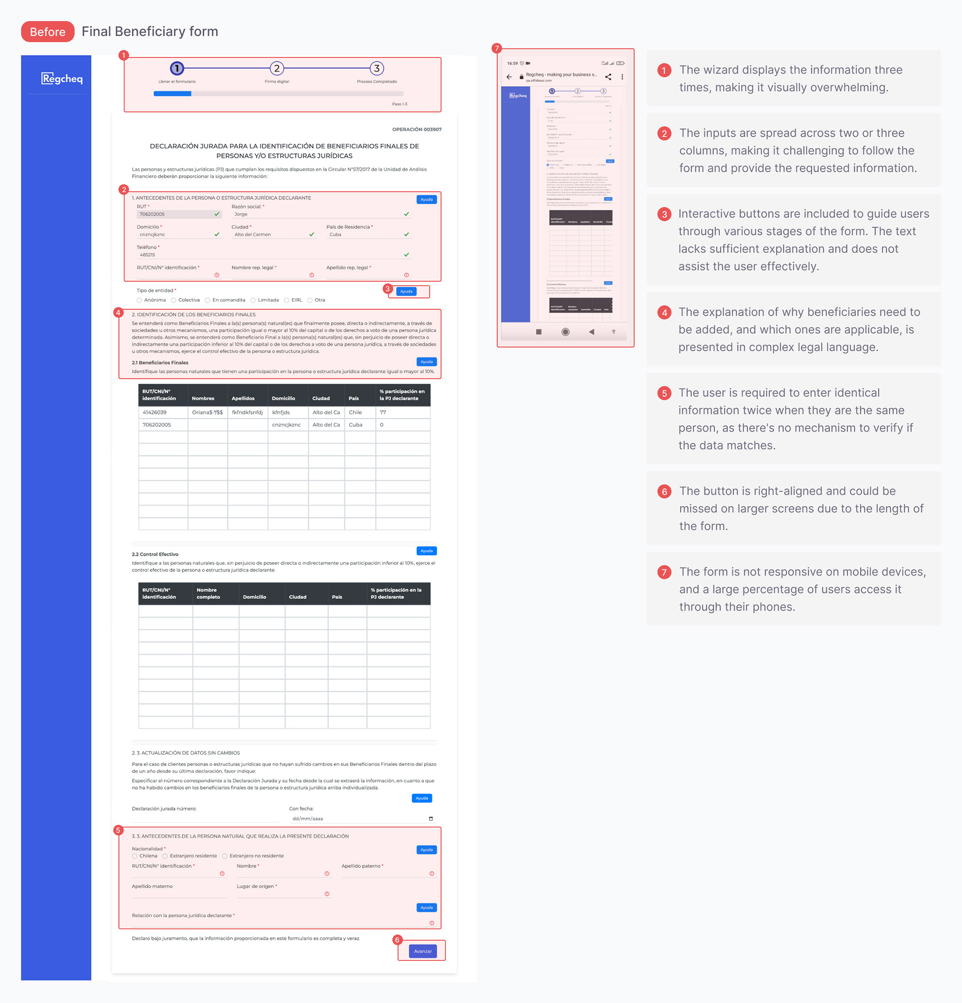
• The digital form replaced the paper version with the promise of more signatures, but its usability was poor, resulting in low completion rates. Help texts and buttons weren’t effective; users ignored them.
Goal - Simplify language and layout, break the form into manageable steps, and significantly improve digital signature completion.
Research & Discovery
• Interviewed customer success managers, developers, and a compliance lawyer to understand pain points and develop variations.
• Analyzed user behavior through session videos, heatmaps, and click data with Datadog to identify that help buttons were underused.
• Researched official and third-party versions of the form to find structure and usability improvements.
Regcheq Form Analysis
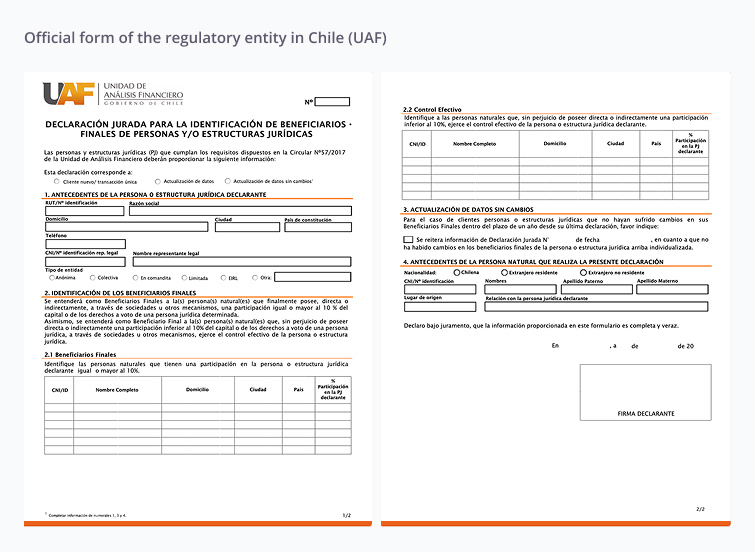
Official form
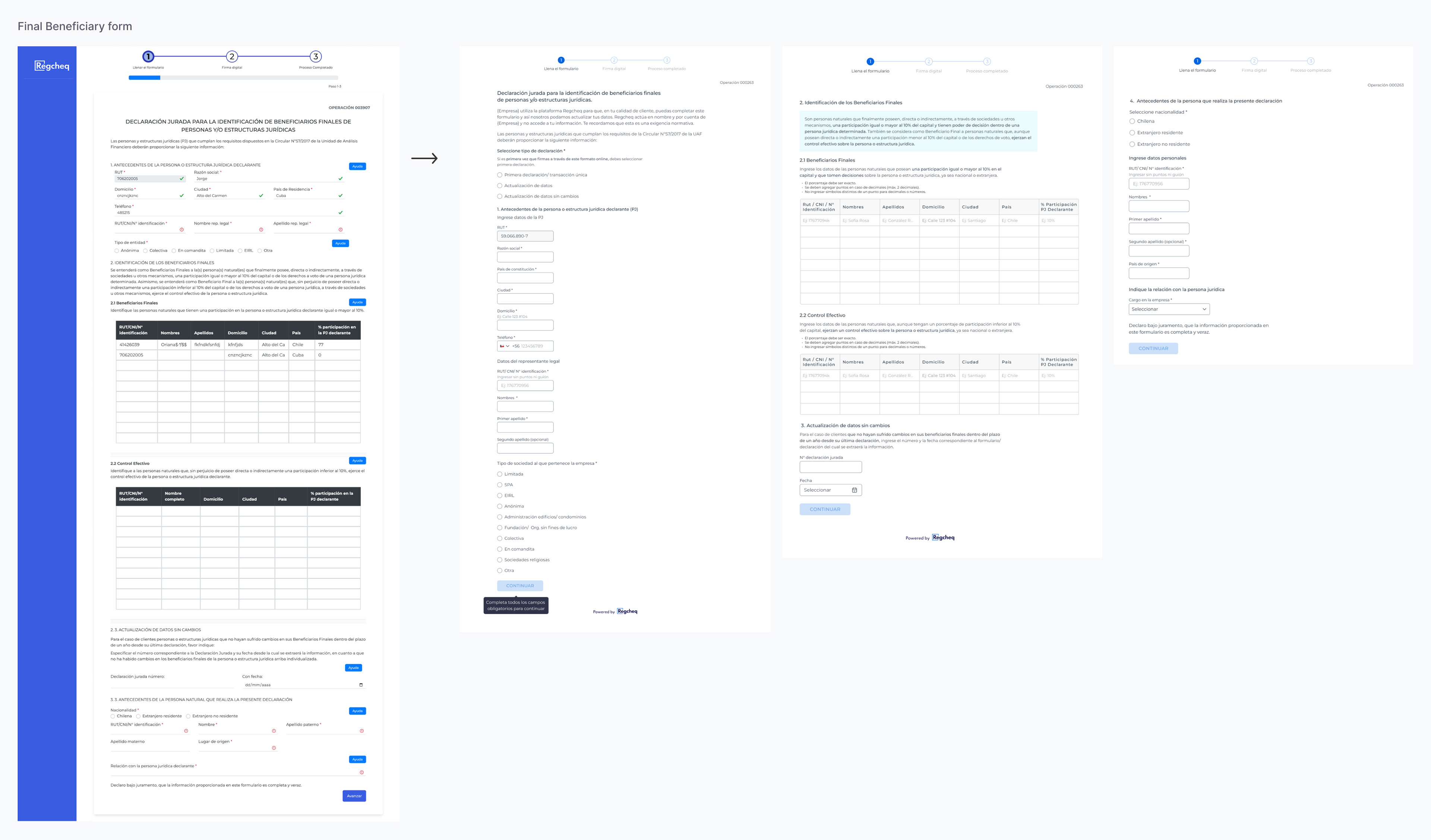
Old vs. New Form
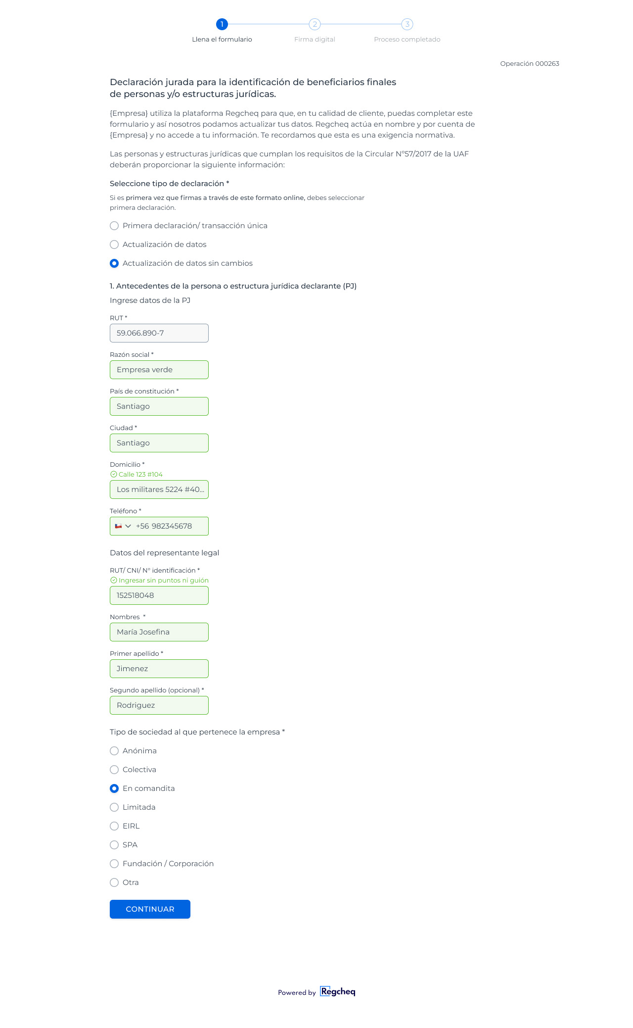
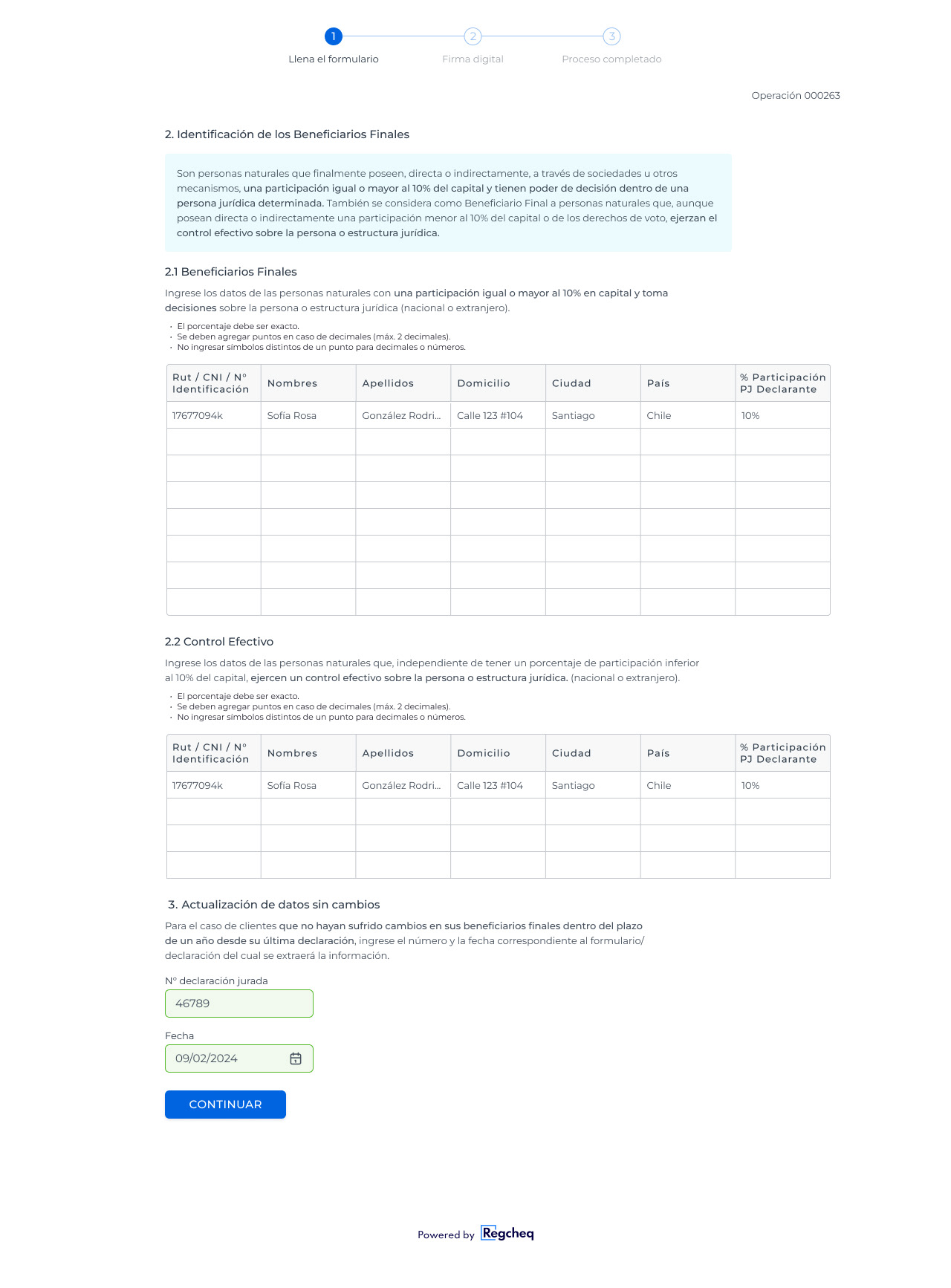
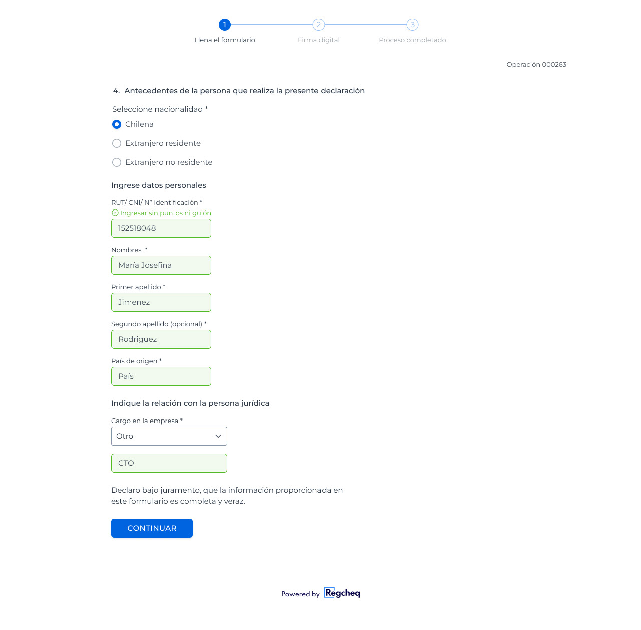
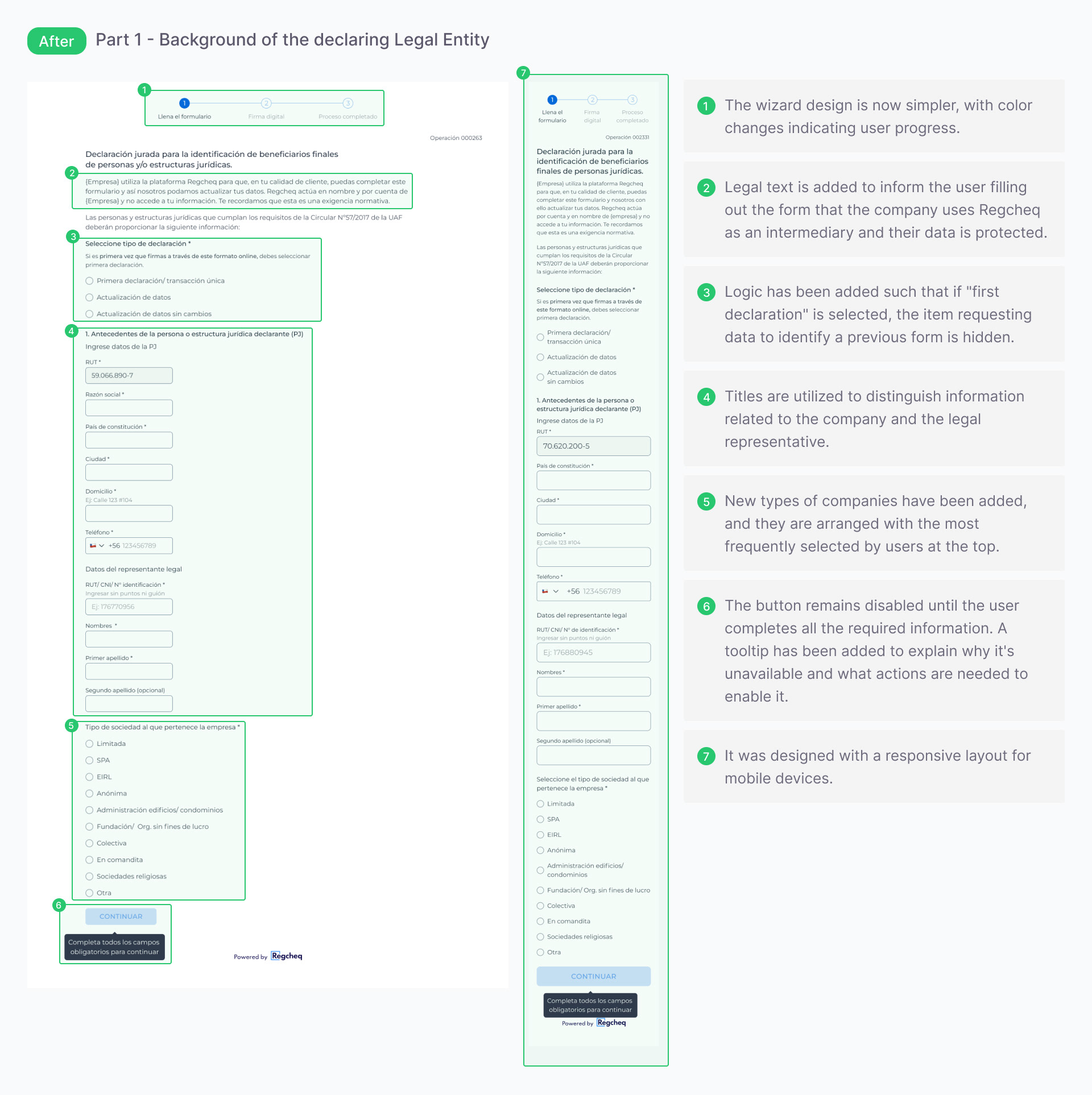
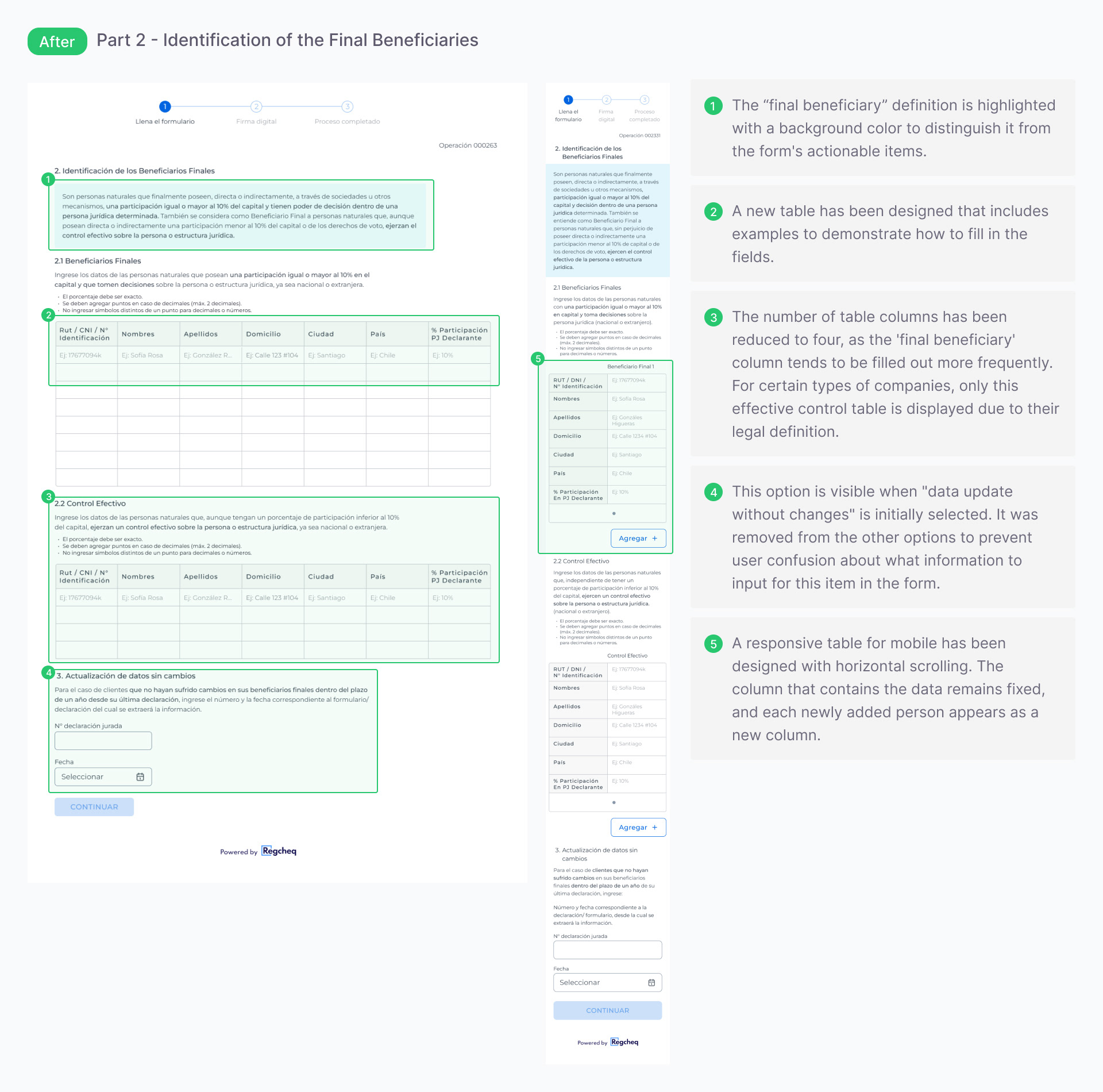
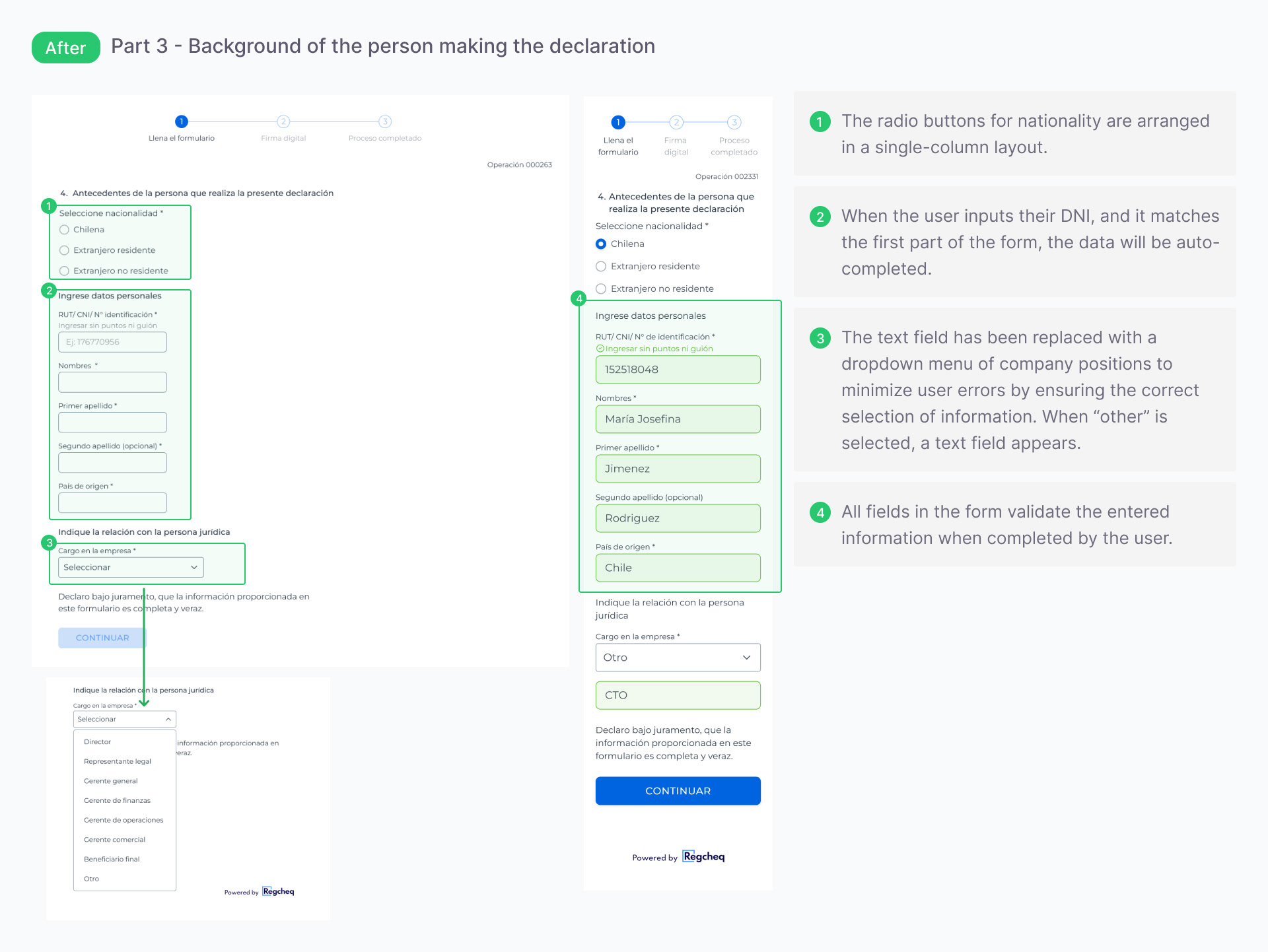
Old: A single, dense page with multiple columns, unclear labels, and buried help features, not intuitive for first-time or non-legal users.
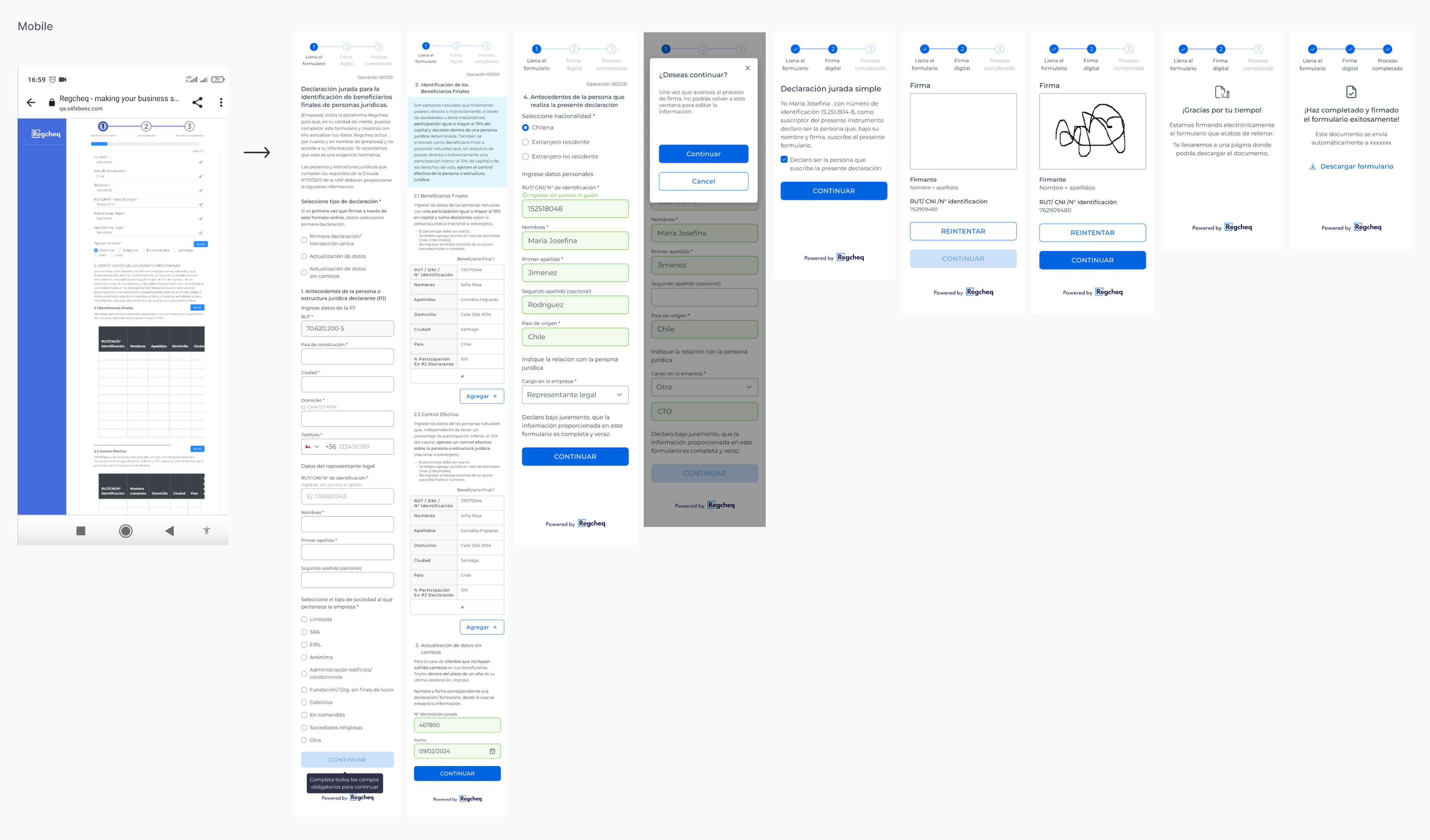
New: A progressive single-column layout organized by logical steps, using simplified legal language and a mobile-friendly design with consolidated components. It is optimized for mobile devices, as users primarily fill out and sign the form on their phones.
Key Design Solutions
Language Simplification
Collaborated with compliance to rewrite labels into clear, user-friendly terms.
Collaborated with compliance to rewrite labels into clear, user-friendly terms.
Progressive Layout
Switched from multi-column to single-column, step-by-step layout to improve mobile usability.
Switched from multi-column to single-column, step-by-step layout to improve mobile usability.
Help Visibility
Reorganized and clarified help content, integrating it into the context instead of hiding behind rarely clicked icons.
Reorganized and clarified help content, integrating it into the context instead of hiding behind rarely clicked icons.
Design System Integration
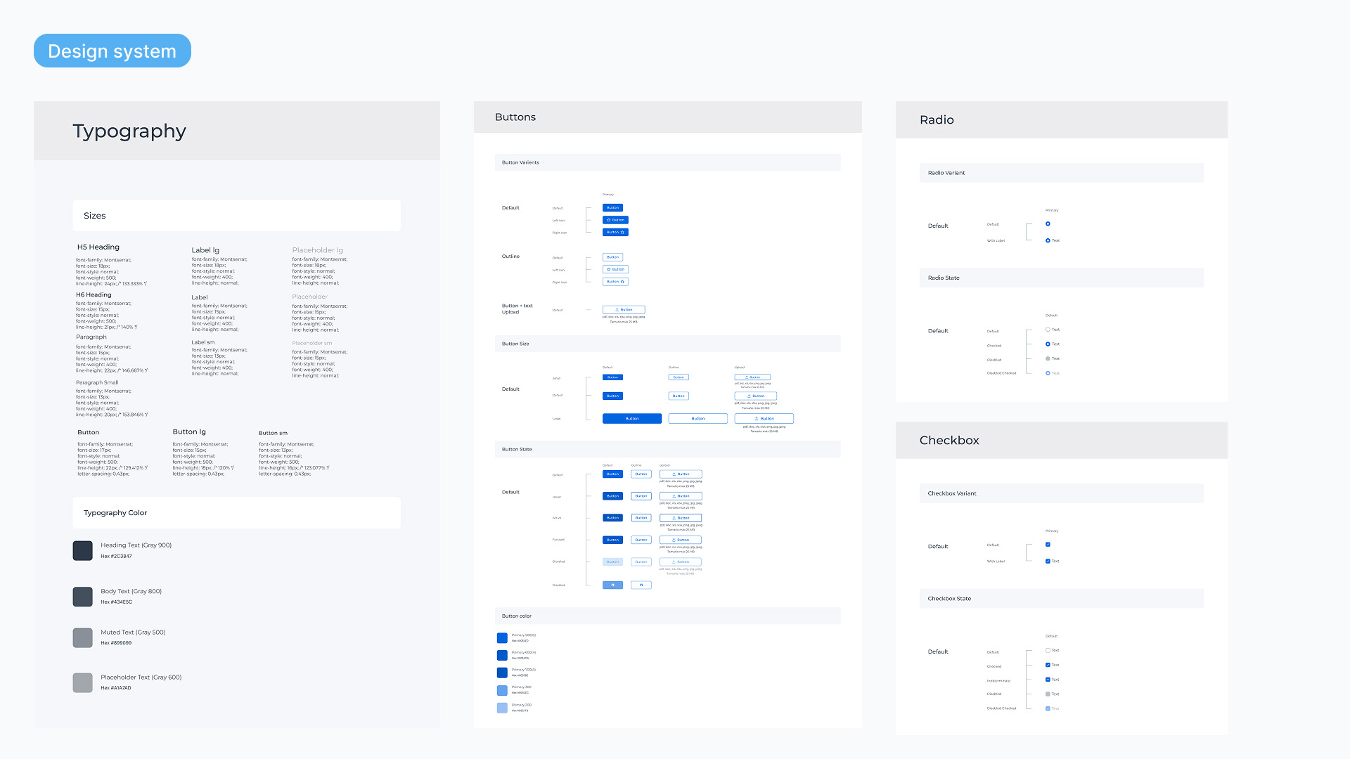
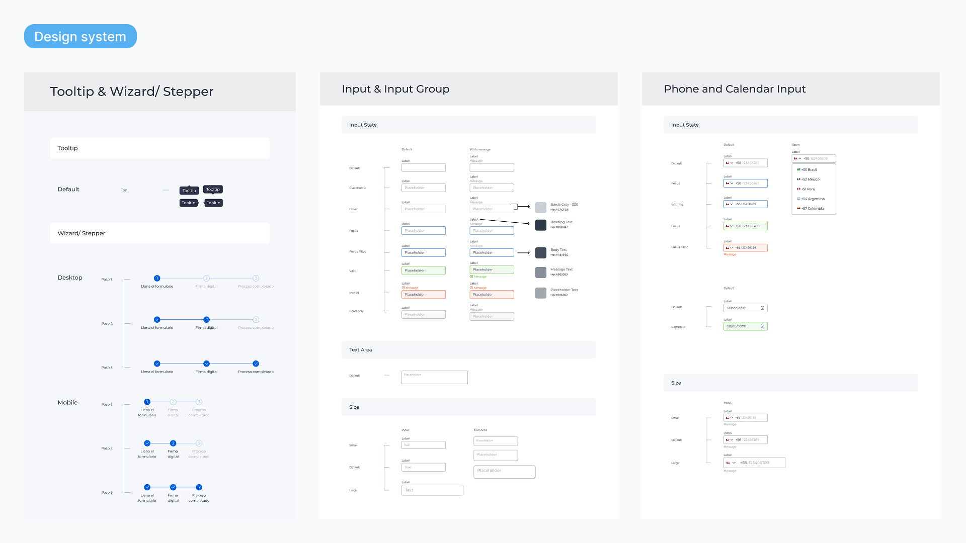
Updated typography, colors, and components within Storybook to ensure visual consistency and scalability across the platform.
Updated typography, colors, and components within Storybook to ensure visual consistency and scalability across the platform.
Iterative Staging
Launched in phases due to limited development resources, starting with internal layout improvements and progressing to a full form redesign.
Launched in phases due to limited development resources, starting with internal layout improvements and progressing to a full form redesign.
Design System
The company purchased a design system, and I updated the foundational elements, typography, and brand colors to ensure visual consistency.
For this project, we began collaborating with developers using Storybook to document the design components. Our plan was to start with the forms and then gradually extend this approach to the rest of the software.
Key Outcomes & Results
• The number of signed forms increased from 5% to 23% after implementing the new design during the pilot phases.
• Cross-team adoption: Sparked efforts to redesign other due diligence forms on the platform.
• Improved readability and ease of use, validated by positive internal and user feedback.
Reflections
• Simplifying language can significantly increase adoption, particularly in complex legal workflows.
• Incorporating behavioral analytics (e.g., heatmaps, click data) was crucial for identifying hidden usability issues.
• Collaborated with compliance, customer success, and development to align design improvements with business priorities.
• Moving forward, I would add field-level analytics and user testing to track drop-off points and further refine the process.