Macal, a Chilean auction house founded in 1982, enhanced its online presence in 2021. However, the payment and pledge process has caused confusion and friction, leading users to contact support and abandon their participation.
Unlike e-commerce platforms, which generally charge fees for shipping and handling, auction platforms require users to pay a fee to participate and purchase items.
My Role: Senior UX/Product Designer
I spearheaded the comprehensive redesign of Macal's payment and pledge-taking process, leading research, problem identification, and user flow definition. I facilitated stakeholder alignment and guided the handoff of design to development, resulting in a simpler, more transparent process that enhances customer participation and bidding in the auction, thereby improving the overall user experience.
The initial payment required to participate in an auction is called a "pledge." If a customer successfully purchases a car or real estate, the pledge is deducted from the total payment.
Challenge
• Confusing terminology, especially around pledges and refunds, was not well-explained.
• Mandatory pop-ups after login and an unused form caused user drop-off.
• Multi-step journaling was too complex and slowed down the process.
• Unclear timelines for payments and refunds increased user frustration.
Goal - Make the process more intuitive, transparent, and efficient, reducing support needs while increasing the number of completed pledges.
Research & Discovery
• Conducted interviews with the customer support team to identify user challenges in the purchasing process and understand operational constraints.
• Performed a heuristic evaluation to identify unnecessary steps and unclear copy.
• Analyze data on payment method preferences to uncover potential opportunities.
• Reviewed customer feedback on social media to assess the company's trustworthiness and identify any potential concerns.
Old vs. New Journey
Old: Intrusive login, redundant journaling, unclear success/failure feedback
New: Streamlined login, simplified pledge management, clear payment timelines, and separate success/failure pages with actionable next steps
The updated process offers a clear, narrative-driven path that guides users through each stage of the payment to participate in the auction.
Key Design Solutions
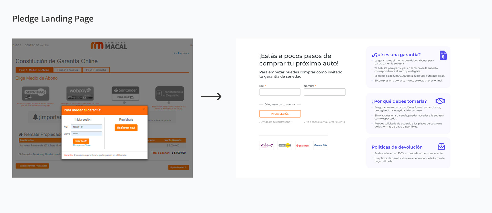
Pledge Landing Page
Simplified login process, clarified “pledge” concept
Simplified login process, clarified “pledge” concept
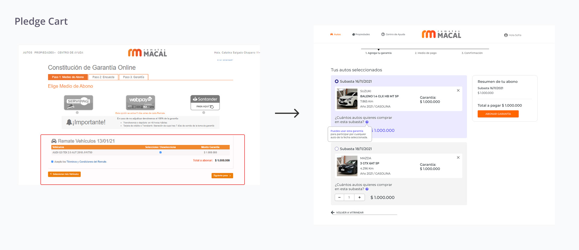
Pledge Cart
Added favorites feature and support for multi-item pledging
Added favorites feature and support for multi-item pledging
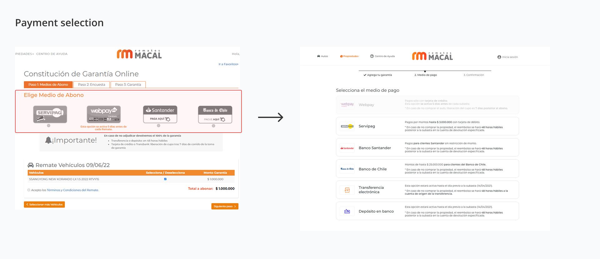
Payment Selection
Clear timelines, improved guidance, and explained limits
Clear timelines, improved guidance, and explained limits
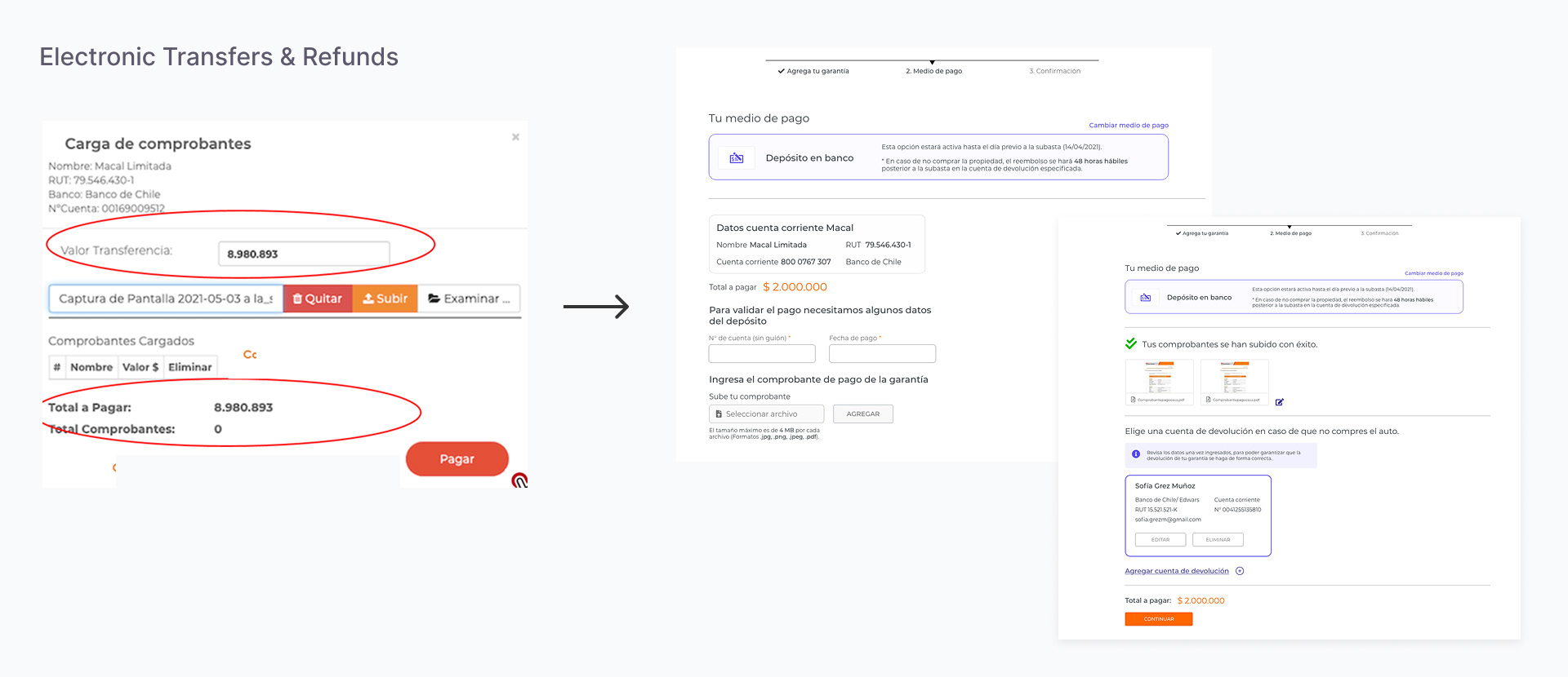
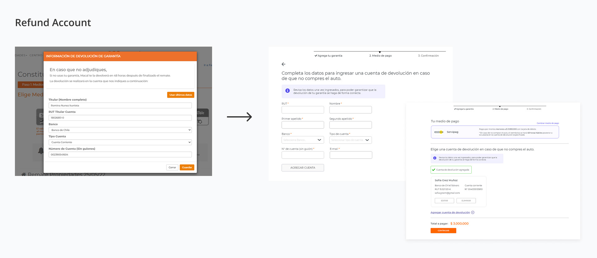
Electronic Transfers & Refunds
Multiple refund accounts for quicker reimbursements
Multiple refund accounts for quicker reimbursements
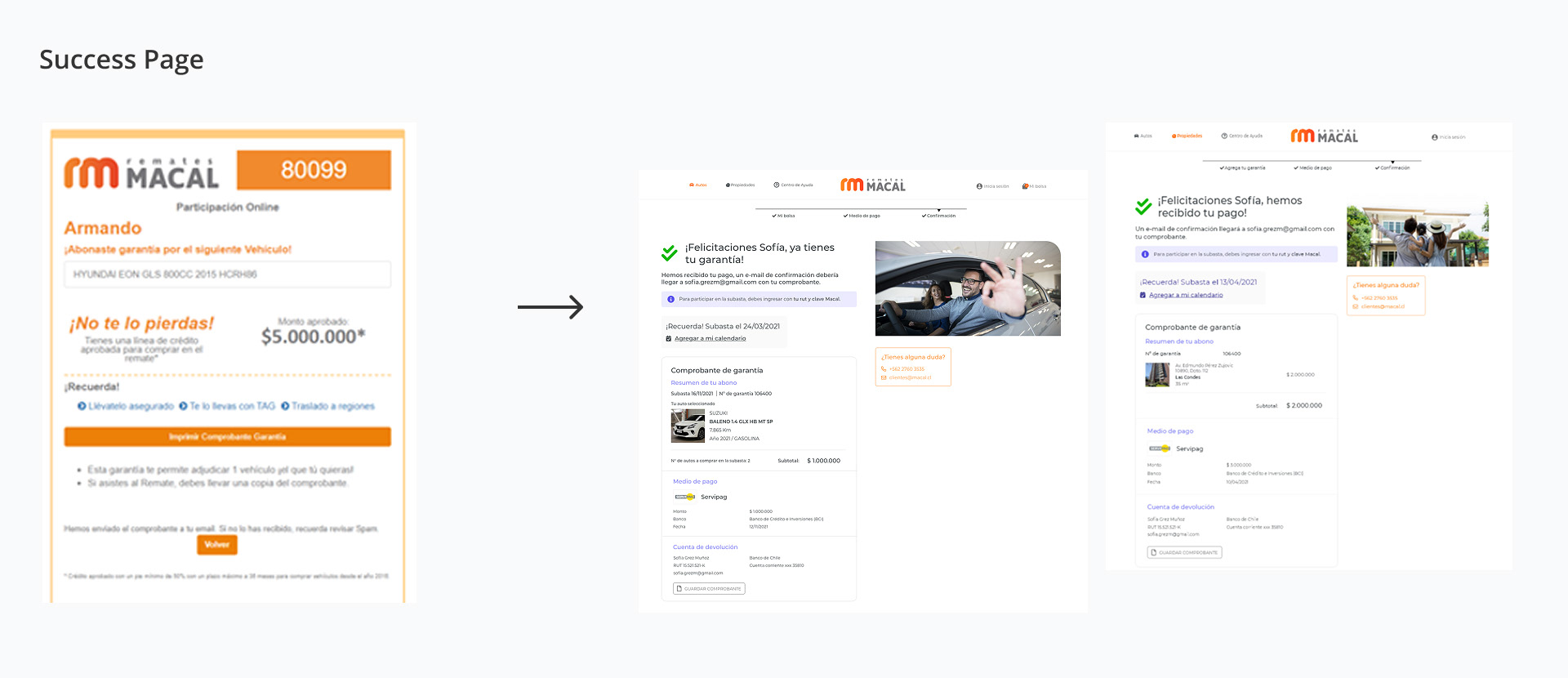
Success & Failure Pages
Clear messages and reminder scheduling
Clear messages and reminder scheduling
Design Handoff
Responsive flows, breakpoints, and animations delivered for smooth development
Responsive flows, breakpoints, and animations delivered for smooth development
Final Design
Handoff
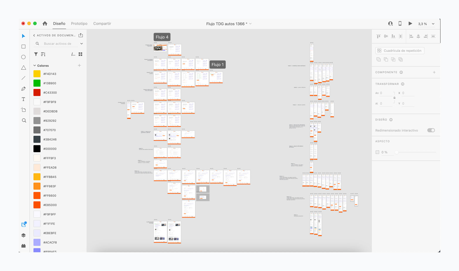
I developed handoff documents for developers that outlined each screen and provided crucial context to ensure a smooth transition. These documents featured organized user flows and were tailored for mobile, 1366px, and 1920px screen sizes.
I worked closely with the development team, highlighting the significance of a clear design handover. To address the issue that animations are often overlooked, I demonstrated each screen individually to ensure that the intended interactions were effectively communicated.
Key Outcomes & Results
Reduced Customer Support Load
The enhancements significantly reduced the number of calls and support tickets received by the customer support team, resulting in fewer instances of confusion over pledges.
The enhancements significantly reduced the number of calls and support tickets received by the customer support team, resulting in fewer instances of confusion over pledges.
Simplified Operational Processes
Manual intervention in the purchasing process was reduced, making it easier for executives to identify payments.
Manual intervention in the purchasing process was reduced, making it easier for executives to identify payments.
Decreased leak rate and reduced drop-off
Reducing page load times and improving the user flow significantly lowered the drop-off rate.
Reducing page load times and improving the user flow significantly lowered the drop-off rate.
Reflections
• Clear terminology and progressive disclosure were critical for adoption.
• Future iterations will focus on early-stage A/B testing to validate assumptions.
• Collaboration with product, developers, and support teams aligned business needs with user goals.